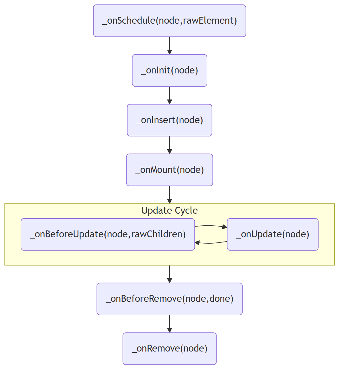
# Domphy — Full LLM Context > One-shot dump for code generation. Contains: critical rules, quickstart, core runtime docs, theme docs, and every `@domphy/ui` patch source. Prefer the curated `llms.txt` index for targeted lookups. --- ## Critical rules - Build UIs as plain objects keyed by HTML tag. Apply patches via `$`. Never wrap in components. - Never inline typography styles. Use typography patches: `small()`, `paragraph()`, `heading()`, `link()`, `strong()`, `emphasis()`, `code()`, `keyboard()`. - For forms, compose `form()` + `field()`. Do NOT wire `FormState`/`FieldState` manually. - `field` patch `value`/`checked` must be static defaults, never reactive — reactive bindings loop forever. - Build tool: tsup. Docs: VitePress. --- ## Landing # Domphy **A Patch-based UI. Native elements, no components.** Domphy is split into 3 packages: - `@domphy/core` - `30kb` minified - `@domphy/theme` - `8kb` minified - `@domphy/ui` - `80kb` minified In practical terms: - `@domphy/core` is the runtime layer, roughly comparable to `react-dom` + SSR rendering + CSS-in-JS in one package - `@domphy/theme` and `@domphy/ui` together are the design-system layer, roughly comparable to what people usually expect from MUI Domphy removes component boundaries, unifies SSR and CSR under one model, automates context-aware styling, and works with any JavaScript library without adapters or plugins. ## Why Domphy From the author: > I published Domphy in February 2026, at 41 years old. I spent 10 years as a structural architect and 6 years teaching myself to code (2 years with js/ts). Every time I tried to learn React or Vue, something felt wrong: logic scattered between data and UI, too many abstractions, too many plugins just to ship a feature. So I built what I wished existed. > I introduce Patch-based UI Architecture, a paradigm for composing web interfaces distinct from component-based, directive-based, and mixin-based approaches. A Patch is formally defined as a function returning a PartialElement: a composable, stateless descriptor that augments a host element's behavior without wrapping, replacing, or owning it. Unlike existing composition models, a Patch carries no rendering lifecycle, holds no state, and creates no DOM boundary. ## Installation npm install @domphy/ui ``` ```html [CDN] ``` ## Quick Start // source: /docs/demos/core/counting.ts --- ## Quickstart # 5-Minute Quickstart ## Install npm install @domphy/ui ``` ```html [CDN] ``` `@domphy/ui` includes `@domphy/core` and `@domphy/theme` — one install gives you everything. ## 1. Hello World A Domphy element is a plain object. The key is the HTML tag, the value is the content. // source: /docs/demos/quickstart/01-hello.ts No classes, no components, no JSX. Just objects. ## 2. Add Patches A **patch** is a function that adds styling and behavior to an element. Apply it with the `$` property. // source: /docs/demos/quickstart/02-patches.ts Every patch handles its own sizing, spacing, colors, and accessibility. You write the structure — patches do the rest. ## 3. Reactive State Use `toState()` for reactive values. Read with `state.get(listener)` inside a reactive function to auto-subscribe. // source: /docs/demos/quickstart/03-state.ts No virtual DOM, no diffing. Changing state updates only the properties that read it. ## 4. Forms The `form` and `field` patches handle validation, error display, and two-way binding automatically. // source: /docs/demos/quickstart/04-form.ts ## What's Next - [Core concepts](/docs/core/) — Syntax, reactivity, lifecycle - [Theme](/docs/theme/) — Tone, size, density - [All 69 patches](/docs/ui/) — Buttons, inputs, cards, dialogs, and more - [Showcase: Chromametry App](https://chromametry.com) — Full production app built entirely with Domphy - [Research](/docs/research/) — The two papers behind the design system --- ## Core docs ### index.md # Core `@domphy/core` is the runtime of Domphy. It takes plain JavaScript objects and turns them into: - DOM on the client - HTML and CSS for SSR - reactive updates after state changes - lifecycle and patch execution If you only want to understand "how Domphy works", this is the package to learn first. ## What You Write In Domphy, an element is just a plain object. ```ts { button: "Count: 0", class: "primary", onClick: () => console.log("clicked"), } ``` You do not write templates or JSX here. You describe the UI with objects, and `@domphy/core` handles rendering, updates, and SSR. ## Quick Start Client rendering starts by wrapping your root element with `ElementNode`, then calling `render()` with a DOM target. ```ts import { ElementNode } from "@domphy/core" const App = { h1: "Hello Domphy", } const root = new ElementNode(App) root.render(document.getElementById("app")!) ``` That is the core entry point: - define a plain object tree - create an `ElementNode` - render it into the DOM ## What Core Does When you create an `ElementNode`, core handles the full runtime for that tree: - reads the object shape - creates `ElementNode` and `TextNode` instances - renders DOM elements and text nodes - generates scoped CSS from `style` - tracks reactive functions - runs hooks such as `_onInit`, `_onMount`, and `_onBeforeRemove` - can generate HTML and CSS for SSR ## Package Boundary The packages have different jobs: | Package | Role | | --- | --- | | `@domphy/core` | object syntax, rendering, reactivity, lifecycle, SSR | | `@domphy/theme` | design tokens and theme CSS | | `@domphy/ui` | ready-made patches such as `button()`, `dialog()`, `tabs()` | If you are learning Domphy from the bottom up, start with `core`, then move to `theme` and `ui`. ## Read In This Order Use this order if you are learning core for the first time: 1. [Syntax](./syntax) - object shape, reserved keys, attributes, style, events, hooks 2. [Reactivity](./reactivity) - how listener-based updates work 3. [Lifecycle](./lifecycle) - when hooks run and what each hook is for 4. [SSR](./ssr) - `generateHTML()`, `generateCSS()`, `render()`, and `mount()` 5. [Portal](./portal) - render DOM outside the logical parent 6. [Insert Content](./patterns/insert-content) - practical patterns for adding and updating children If you need exact method signatures, use the API Reference in the sidebar after reading these guides. ### lifecycle.md # Lifecycle Hooks fire in a fixed linear sequence. Each step exposes more of the node as it progresses. Lifecycle Hooks ```ts import { DomphyElement, merge } from "@domphy/core" const App: DomphyElement<"div"> = { div: "Hello", _onSchedule: (node, rawElement) => { const theme = node.getContext("theme") merge(rawElement, { style: { color: theme === "dark" ? "#fff" : "#000", }, }) }, _onInsert: (node) => { const index = node.parent!.children.items.indexOf(node) node.setMetadata("index", index) }, _onMount: (node) => { const observer = new ResizeObserver(() => { console.log(node.domElement!.offsetWidth) }) observer.observe(node.domElement!) node.addHook("BeforeRemove", () => observer.disconnect()) }, _onBeforeUpdate: (node, rawChildren) => { console.log("incoming:", rawChildren.length) }, _onUpdate: (node) => { console.log("children updated:", node.children.items.length) }, _onBeforeRemove: (node, done) => { node.domElement! .animate([{ opacity: 1 }, { opacity: 0 }], { duration: 300 }) .onfinish = done }, _onRemove: () => { console.log("removed") }, } ``` ## Hook Order | Hook | When | What's available | | --- | --- | --- | | `_onSchedule(node, raw)` | Before parsing, while the raw element can still be changed | `parent`, `_context`, `_metadata`, mutable `raw` | | `_onInit(node)` | After parsing, before insertion | node properties, no siblings yet | | `_onInsert(node)` | Added to the parent child list | siblings, position in tree | | `_onMount(node)` | DOM element created and connected to the node | `domElement` and all node properties | | `_onBeforeUpdate(node, rawChildren)` | Before a child update cycle applies new children | current node, current DOM, incoming raw children | | `_onUpdate(node)` | After the update cycle finishes | updated children and `domElement` | | `_onBeforeRemove(node, done)` | Before removal, must call `done()` | `domElement`, current runtime state | | `_onRemove(node)` | After the node is fully removed | node instance after removal work completes | `_onSchedule` is the right place to apply context-aware patches. Unlike inline `$: [patches]`, it can read parent context before parsing begins. See also [ElementNode API](./api/element-node). ### portal.md # Portal `_portal` redirects where an element's DOM renders — the element stays in the logical Domphy tree, but its DOM node is appended to a different parent. ```ts { div: "Tooltip content", _portal: () => document.body, } ``` `rootNode` is the app root `ElementNode`. Use it to query or insert overlay containers: ```ts { div: "...", _portal: (rootNode) => { let overlay = rootNode.domElement!.querySelector("#my-overlay") if (!overlay) { overlay = document.createElement("div") overlay.id = "my-overlay" rootNode.domElement!.appendChild(overlay) } return overlay }, } ``` ## Why Use Portals Without `_portal`, fixed or absolute overlays inherit `overflow: hidden` and stacking context from ancestor elements, which causes clipping and layering bugs. ## Properties - The element's logic remains tied to its position in the Domphy tree - Only the DOM node moves - CSS generated by the element is still injected normally - `_portal` is evaluated once at mount time Use it for overlays that must escape ancestor layout constraints: tooltips, dropdowns, toasts, and modal layers. ### reactivity.md # Reactivity Domphy uses listener-based reactivity. Any value can be a function that receives a `listener`. When a subscribed state changes, Domphy re-runs only that reactive part. Reactivity ```ts const count = toState(0) const counter = { button: (listener) => `Count: ${count.get(listener)}`, onClick: () => count.set(count.get() + 1), } ``` `count.get(listener)` does two things: - returns the current value - subscribes that reactive function to future changes Subscriptions are released automatically when the node is removed. // source: /docs/demos/core/counting.ts ## Attributes Reactive attributes are already fine-grained. When the state changes, Domphy updates only that attribute. ```ts const open = toState(false) const button = { button: "Toggle", ariaExpanded: (listener) => open.get(listener), disabled: (listener) => !open.get(listener), } ``` This does not re-create the node. It only updates the affected DOM attributes. Use reactive attributes for: - `disabled` - `hidden` - `value` - `aria-*` - `data-*` - any attribute whose value should track state directly ## CSS Props Reactive CSS properties are also fine-grained. Domphy updates only the specific CSS declaration that changed. ```ts const active = toState(false) const box = { div: "Hello", style: { color: (listener) => active.get(listener) ? "red" : "gray", opacity: (listener) => active.get(listener) ? 1 : 0.5, }, } ``` This is different from re-rendering the whole node. The existing style rule stays mounted; only the changed CSS properties are updated. Use reactive style props when: - the element itself stays the same - only visual state changes - you want the smallest possible DOM/CSS update ## Children Update Reactive children are more complex than attributes or CSS props. When the child function runs again, Domphy calls `children.update(...)` and reconciles the child list. ```ts const items = toState([ { id: 1, name: "A" }, { id: 2, name: "B" }, ]) const list = { ul: (listener) => items.get(listener).map(item => ({ li: item.name, _key: item.id, })), } ``` ### Default Rerender For light children such as text or simple unkeyed content, the default reactive child update is usually enough. ```ts const count = toState(0) const app = { p: (listener) => `Count: ${count.get(listener)}`, } ``` This is the simplest form and should be the default choice for simple text children or lightweight child trees. ### Fine-Grain With `_key` When children are dynamic lists, `_key` gives Domphy a reconciliation identity. ```ts const list = { ul: (listener) => items.get(listener).map(item => ({ li: item.name, _key: item.id, })), } ``` `_key` is used only for child diffing. If the key matches, Domphy reuses the existing node instance and DOM node instead of creating a new one. Use `_key` when: - items can reorder - items can insert in the middle - items can be removed from the middle - child instances carry important runtime behavior Without `_key`, child diffing is more positional. ### Fine-Grain With Low-Level API For the most control, update the child list imperatively through the `ElementList` API instead of relying on a reactive child function to rebuild the array. ```ts const app = { div: [ { button: "Add child", _onInit: (node) => { node.addEvent("click", () => { node.parent!.children.insert({ span: "New child" }) }) }, }, ], } ``` Or inside a normal event handler: ```ts { button: "Add child", onClick: (_, node) => { node.parent!.children.insert({ span: "New child" }) }, } ``` This is also fine-grained: - `insert()` creates only the new child - `remove()` removes only that child - `move()` reorders existing children - `swap()` swaps existing children Use the low-level API when updates are event-driven and local, and when you want explicit control over exactly which child changes. ## External State Systems Domphy does not enforce a state architecture. Any system that can call a function works: ```ts store.subscribe(() => listener()) // Zustand atom.subscribe(() => listener()) // Nanostores count$.subscribe(() => listener()) // RxJS ``` → [State API](./api/state) ## Not To Do - Do not create reactive update loops where one reactive read immediately feeds an event that writes the same source again without a clear boundary. ```ts const text = toState("") const field = { input: null, value: (listener) => text.get(listener), onChange: (event) => text.set((event.target as HTMLInputElement).value), } ``` - Do not think of this as two-way binding; treat it as one-way data flow instead, where state drives the view and events explicitly write the next state. ```ts const text = toState("") const field = { input: null, value: (listener) => text.get(listener), onInput: (event) => { text.set((event.target as HTMLInputElement).value) }, } ``` - Do not move ordinary form synchronization into hooks; keep it in flat event handlers such as `onInput`, `onChange`, or `onClick` so the read path and write path stay visible. ### ssr.md # SSR Domphy uses the same element definition for CSR and SSR — no duplicate templates. ## Client Render ```ts new ElementNode(App).render(document.body) ``` Call `render()` once at the app root for client-side rendering. ## Server-Side Rendering SSR import { ElementNode } from "@domphy/core" import { themeCSS } from "@domphy/theme" import App from "./app.js" const node = new ElementNode(App) const page = `
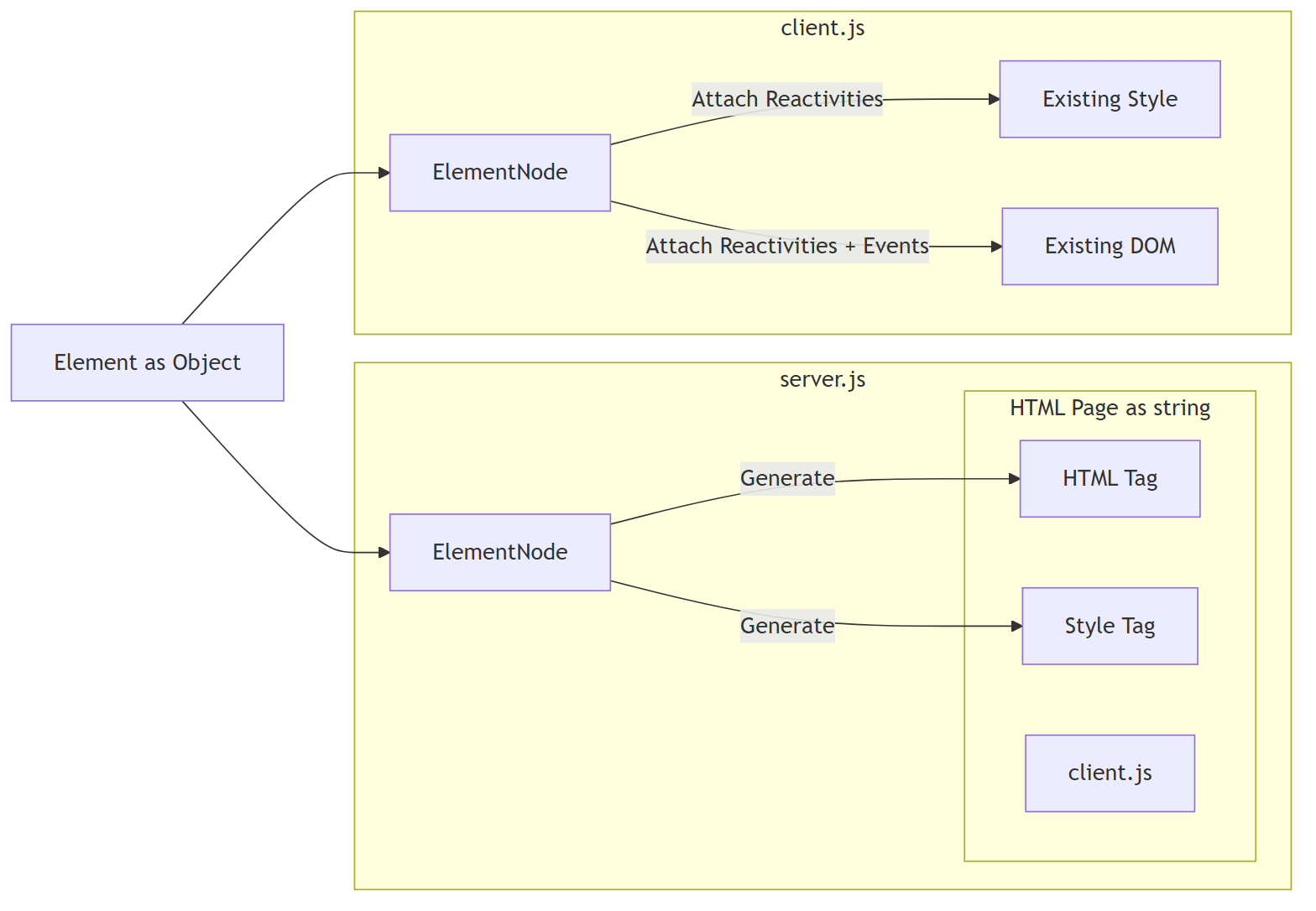
${node.generateHTML()}
` ``` ```ts [client.js] import { ElementNode } from "@domphy/core" import App from "./app.js" const domStyle = document.getElementById("domphy-style") as HTMLStyleElement new ElementNode(App).mount(document.getElementById("app")!, domStyle) ``` For SSR, render CSS into `
...
` ``` If the CSS is already in the HTML, the client usually does not need to call `themeApply()` again unless you later change registered themes. For the full API surface, see [API](./api). ### size.md # Size Domphy keeps `size`, `density`, and `spacing` separate, but they work together in one sizing model. The base unit is: `U = fontSize / 4` At `fontSize: 16px`, `U = 4px`. Use: - `themeSize(listener, key)` to resolve font size from `dataSize` - `themeDensity(listener)` to resolve the current density factor from `dataDensity` - `themeSpacing(n)` to convert the final numeric result into CSS units ## Overview Think of the sizing pipeline like this: 1. `themeSize()` sets the local text scale 2. that font size defines `U` 3. `themeDensity()` changes how compact or loose the geometry feels 4. formulas produce numeric spacing values in units of `U` 5. `themeSpacing()` converts the final number into a CSS length ## Size `size` controls typography scale through `dataSize` and `themeSize()`. Use it when the local subtree should inherit a larger or smaller text scale. ```ts fontSize: (listener) => themeSize(listener, "inherit") ``` This is the part that defines the local `fontSize`, and therefore defines the local unit: `U = fontSize / 4` If the subtree font size changes, every formula built on `U` changes with it. ## Density `density` controls compactness through `dataDensity` and `themeDensity()`. Use it when the component should feel tighter or looser without changing the type scale. Core variable: - `d` = current density factor Density factors come from the current theme: `[0.75, 1, 1.5, 2, 2.5]` Default density: `d = 1.5` Typical read: ```ts const d = themeDensity(listener) ``` `themeDensity()` returns a number, not a CSS value. It is a multiplier used inside sizing formulas. ## Spacing `spacing` is the final CSS length produced from the numeric result. Use `themeSpacing(n)` after the geometry has already been decided. ```ts gap: themeSpacing(3) paddingInline: themeSpacing(themeDensity(listener) * 3) ``` So the role split is: - `themeSize()` sets the scale - `themeDensity()` sets the multiplier - `themeSpacing()` emits the CSS value ## Geometry Variables - `n` = intrinsic text lines - `w` = wrapping level - `d` = current density factor ## Wrapping Level ```txt w = 0 inline / no boundary w = 1 single-line bounded control w = 2 multi-line bounded block w = 3 structural section / large overlay ``` Examples: | w | Class | Example | | --- | --- | --- | | 0 | inline / no boundary | text, icon, inline label | | 1 | single-line bounded | button, input, select, tooltip | | 2 | multi-line bounded | textarea, blockquote, card | | 3 | structural section | dialog, drawer, fieldset | ## Geometry Formulas Internal component geometry is formula-driven: ```txt paddingBlock = d * w * U paddingInline = ceil(3 / w) * d * w * U for w >= 1 paddingInline = 2dU for bounded inline w = 0 radius = paddingBlock height = (n * 6 + 2 * d * w) * U ``` For single-line bounded controls (`n = 1`, `w = 1`): ```txt height = (6 + 2d) * U ``` At default density `d = 1.5`, that becomes: ```txt height = 9U paddingBlock = 1.5U paddingInline = 4.5U radius = 1.5U ``` At `fontSize: 16px`: ```txt height = 36px paddingBlock = 6px paddingInline = 18px radius = 6px ``` ## Industry Validation The height formula produces the canonical button sizes used across major design systems — not by coincidence, but because those systems converged on the same proportions through practice. At `fontSize: 16px` (`U = 4px`), `n = 1`, `w = 1`: | Density `d` | Formula `(6 + 2d) * U` | Height | Matches | | --- | --- | --- | --- | | 0.75 | `(6 + 1.5) * 4` | **30px** | MUI small | | 1 | `(6 + 2) * 4` | **32px** | Ant Design medium · Chakra small · GitHub medium | | 1.5 | `(6 + 3) * 4` | **36px** | MUI medium | | 2 | `(6 + 4) * 4` | **40px** | Ant Design large · Chakra medium · GitHub large | | 2.5 | `(6 + 5) * 4` | **44px** | MUI large range | These are not hardcoded sizes. They emerge from one formula across five density levels. The formula does not prescribe what height a button must be. It reveals the underlying structure that the industry already arrived at through intuition and iteration. ## Putting Them Together ```ts import { themeColor, themeDensity, themeSize, themeSpacing } from "@domphy/theme" const button = { button: "Buy", dataDensity: "inherit", style: { fontSize: (listener) => themeSize(listener, "inherit"), paddingBlock: (listener) => themeSpacing(themeDensity(listener) * 1), paddingInline: (listener) => themeSpacing(themeDensity(listener) * 3), borderRadius: (listener) => themeSpacing(themeDensity(listener) * 1), backgroundColor: (listener) => themeColor(listener, "inherit", "primary"), color: (listener) => themeColor(listener, "shift-9", "primary"), }, } ``` This reads as: - `themeSize(listener, "inherit")` -> local font size - `themeDensity(listener)` -> current `d` - `* 1` / `* 3` -> geometry factor for that edge - `themeSpacing(...)` -> final CSS unit ## Reference Table Base density `d = 1.5`: | Level | w=0 | w=1 | w=2 | w=3 | | --- | --- | --- | --- | --- | | height (`n = 1`) | 6U | 9U | 12U | 15U | | paddingBlock | 0 | 1.5U | 3U | 4.5U | | paddingInline | 3U* | 4.5U | 6U | 4.5U | | radius | 0 | 1.5U | 3U | 4.5U | At `fontSize: 16px`: | Level | w=0 | w=1 | w=2 | w=3 | | --- | --- | --- | --- | --- | | height (`n = 1`) | 24px | 36px | 48px | 60px | | paddingBlock | 0 | 6px | 12px | 18px | | paddingInline | 12px* | 18px | 24px | 18px | | radius | 0 | 6px | 12px | 18px | \* For `w = 0`, inline padding only applies to bounded inline surfaces such as `tag`, `badge`, or `code`. Pure text or icon inline content has no outer padding. ## Sub-Baseline Scale Elements intentionally below the `6U` text baseline use the fixed proportional sub-scale: `2U / 4U / 6U` These stay fixed unless the patch explicitly defines another rule. ## Layout Spacing Internal geometry is formula-driven. Layout spacing between separate regions is not. Practical rule: - horizontal `gap` / `margin-inline` should usually be at least the related `paddingInline` - vertical `gap` / `margin-block` should usually be at least the related `paddingBlock` Example at base density: ```ts gap: themeSpacing(4.5) // >= w=1 paddingInline gap: themeSpacing(3) // >= w=2 paddingBlock ``` ## Recommendation Use `outline` or `box-shadow` instead of `border` when the sizing formula matters. At `w = 1`, `d = 1.5`: - formula height = `9U = 36px` - a `1px` border on both sides adds `2px` - total rendered height becomes `38px` That is a `5.56%` deviation from the sizing model. For the underlying tone model, see [Tone](./tone). ### tone.md # Tone Use `themeColor(listener, tone, color?)` from `@domphy/theme` to resolve colors from theme context. Tone Model ## Tone Span `Tone Span` is the contrast-span model derived in the Chromametry paper for sequential monochromatic ramps. - For a color family with `N` ordered lightness steps, `K` is the minimum index distance that guarantees WCAG `4.5:1` contrast for all valid pairs in that family. - This turns contrast selection into a fixed index rule instead of repeated runtime checking. - In the current Domphy light ramp, `N = 18`, so the working span is `K = 9`. Formal definition: ```txt K = min { k : CR(c_i, c_{i+k}) >= 4.5 for all valid i } ``` For the formal definition, benchmark method, and cross-system results, see: - Repo: https://github.com/chromametry/chromametry - Paper: https://github.com/chromametry/chromametry/blob/main/paper/paper.pdf ## Tone System Hierarchy Domphy's tone system is built on three independent logical layers. This is the abstract model, before any concrete step count or ramp mapping is applied. ### 1. Layer 1: Context Surface This is **The Floor**. It is not the state of the object itself, but the environment that contains it. - **Role:** Defines the local tone field for a subtree. - **Meaning:** Establishes the anchor from which child elements are measured. - **Behavior:** Gives the system a stable surface reference so descendant tones can be interpreted relative to the same anchor. ### 2. Layer 2: Semantic Zone This is **The Seat**. It describes the object's stable semantic position before any interaction happens. - **Role:** Encodes meaning, not interaction. - **Meaning:** Distinguishes resting, positional, and emphasized states. - **Behavior:** Creates persistent semantic separation between elements that share the same context surface. ### 3. Layer 3: Interactive Delta This is **The Action**. It is a temporary modifier applied on top of the semantic zone during interaction. - **Role:** Expresses live response such as hover or press. - **Meaning:** It is transient and should never redefine the semantic identity of the element. - **Behavior:** Adds a small offset so interaction remains visible without collapsing into another semantic zone. ### General Formula At the abstract level, the final tone is always resolved from the same three-layer composition: ```txt T = C_surface + S_zone + I_delta ``` Where: - `T` means the final tone - `C_surface` means the context surface anchor - `S_zone` means the semantic zone offset - `I_delta` means the interactive offset This formula is the core rule of the hierarchy: context defines the anchor, semantics define the stable zone, and interaction adds a temporary local delta. --- ## Tone Mapping This section applies the abstract hierarchy to the current Domphy tone ramp. For the current Domphy light ramp: ```txt N = 18 K = 9 ``` `K = 9` is the contrast span reserved by the system between background and text. In practice, this means the first 9 steps can be used for surfaces and state layers, while the contrast target for text begins at step 9 relative to the same anchor. ### 1. Surface Anchors To keep tone progression predictable, the context surface should usually start near one edge of the 18-step ramp. - **Normal surface anchors:** `0`, `1`, `2`, `3` - **Inverted surface anchors:** `17`, `16`, `15`, `14` - The purpose of choosing edge anchors is to keep tone progression moving in one direction inside a single context. - If a surface starts in the middle of the ramp, child tones can hit a clamp before the progression finishes, then appear to bend back toward the opposite side. That produces unstable and visually ugly mapping. - No matter whether the local context is interpreted as increasing or decreasing, the final resolved surface band should still land in one of these two edge ranges. - `0, 1, 2, 3` keep the surface on the low edge so child tones can expand upward in a single clear sequence. - `17, 16, 15, 14` keep the surface on the high edge so child tones can still be mapped consistently in the inverted case. AI should prefer these surface anchors and avoid arbitrary middle anchors unless there is a specific reason. ### 2. Semantic Mapping To keep the system structured, Domphy maps the semantic layer into three equal regions inside the available `K = 9` surface span: - **Default zone:** `0` - **Indicator zone:** `K / 3 = 3` - **Accent zone:** `2K / 3 = 6` This is why `K = 9` is a strong fit. It divides cleanly into three semantic anchors: - `0` for rest - `3` for indicator - `6` for accent These anchors are far enough apart to be perceptually distinct while still remaining below the text threshold at `9`. ### 3. Interaction Mapping Interactive deltas stay intentionally small: - **Hover:** `+1` or `-1` - **Active:** `+2` or `-2` That gives each semantic anchor its own local interaction range without collisions: - `0` -> `1` -> `2` - `3` -> `4` -> `5` - `6` -> `7` -> `8` Because the three semantic anchors are spaced by `3`, and the largest interaction delta is `2`, every resulting tone remains unique. The proof below applies the general formula from the hierarchy section on top of those surface anchors. **Proof matrix (example with `Context Surface = 0` and `K = 9`):** | Actual state | Logical formula | Result (Final Tone) | | :--- | :--- | :--- | | **Resting component** | `0 + 0 + 0` | **Step 0** | | **Hovered component** | `0 + 0 + 1` | **Step 1** | | **Pressed component** | `0 + 0 + 2` | **Step 2** | | **Static indicator (Menu)** | `0 + K/3 + 0` | **Step 3** | | **Indicator + Hover** | `0 + 3 + 1` | **Step 4** | | **Indicator + Press** | `0 + 3 + 2` | **Step 5** | | **Strong state (Toggle)** | `0 + 2K/3 + 0` | **Step 6** | | **Strong state + Hover** | `0 + 6 + 1` | **Step 7** | | **Strong state + Press** | `0 + 6 + 2` | **Step 8** | **Proof matrix (example with inverted `Context Surface = 17` and `K = 9`):** | Actual state | Logical formula | Result (Final Tone) | | :--- | :--- | :--- | | **Resting component** | `17 + 0 + 0` | **Step 17** | | **Hovered component** | `17 - 0 - 1` | **Step 16** | | **Pressed component** | `17 - 0 - 2` | **Step 15** | | **Static indicator (Menu)** | `17 - K/3 - 0` | **Step 14** | | **Indicator + Hover** | `17 - 3 - 1` | **Step 13** | | **Indicator + Press** | `17 - 3 - 2` | **Step 12** | | **Strong state (Toggle)** | `17 - 2K/3 - 0` | **Step 11** | | **Strong state + Hover** | `17 - 6 - 1` | **Step 10** | | **Strong state + Press** | `17 - 6 - 2` | **Step 9** | **Invariant rule:** The total variation (`Semantic Zone + Interactive Delta`) must stay below `K`. With `K = 9`, the sequence `0, 1, 2, 3, 4, 5, 6, 7, 8` forms three clean semantic bands, and `Step 9` remains the start of the text-contrast region. That is why `9` works well: it divides into three stable zones and still leaves hover and active states unique without overlap. ## Tone Roles When Domphy says `tone` without another qualifier, it usually means the resolved surface or background tone of the element itself. From that base tone, the common visual roles are derived as follows: - **Background / Surface:** the tone itself - **Text:** the tone plus or minus `K` - **Stroke:** the tone plus or minus `K / 3` Here, `stroke` means the structural edge role, such as `outline`, `border`, or a separator line. With the current Domphy light ramp: ```txt K = 9 K / 3 = 3 ``` So the concrete role mapping is: - normal side: `background = tone`, `stroke = tone + 3`, `text = tone + 9` - inverted side: `background = tone`, `stroke = tone - 3`, `text = tone - 9` This is the practical reason tone selection stays anchored near the edges: the derived roles remain ordered, predictable, and do not collapse back into the wrong side of the ramp. ## Shift System Valid tone keys: - `"shift-N"` where `N` is `0` to `17` - `"increase-N"` - `"decrease-N"` - `"inherit"` - `"base"` `dataTone` accepts the same keys. Use them like this: - `inherit` = keep the current local surface - `shift-N` = go to a fixed semantic slot on the current branch - `increase-N` = move further along the current branch - `decrease-N` = move back along the current branch - `base` = jump to the registered base tone of that color family Basic example: ```ts backgroundColor: (l) => themeColor(l, "shift-0", "primary") color: (l) => themeColor(l, "shift-9", "primary") outline: (l) => `1px solid ${themeColor(l, "shift-3", "primary")}` ``` ## Full Example ```ts const button = { button: "Buy", style: { fontSize: (l) => themeSize(l, "inherit"), paddingBlock: (l) => themeSpacing(themeDensity(l) * 1), paddingInline: (l) => themeSpacing(themeDensity(l) * 3), borderRadius: (l) => themeSpacing(themeDensity(l) * 1), backgroundColor: (l) => themeColor(l, "inherit", "primary"), color: (l) => themeColor(l, "shift-9", "primary"), outline: (l) => `1px solid ${themeColor(l, "shift-3", "primary")}`, "&:hover": { backgroundColor: (l) => themeColor(l, "increase-1", "primary"), }, "&:focus-visible": { boxShadow: (l) => `0 0 0 2px ${themeColor(l, "shift-6", "primary")}`, }, }, } ``` ## Context Tone `dataTone` propagates down the tree. Descendants resolve their own tone automatically. ```ts { div: [...], dataTone: "shift-1" } { span: "Error", style: { color: (l) => themeColor(l, "shift-9", "error") } } ``` ## Recommendation Prefer `dataTone` over changing container colors manually. ```ts // better { div: [Button, Text], dataTone: "shift-1", style: { backgroundColor: (l) => themeColor(l, "inherit", "danger"), }, } ``` Use `dataTheme` only when you truly want a different theme, not just a darker or lighter local surface. --- ## UI patch source (`@domphy/ui`) Each block is the authoritative source for a patch — signature, props, style object. These are the contracts to follow. ### abbreviation ```ts import { PartialElement, toState, ValueOrState } from "@domphy/core"; import { themeColor, ThemeColor, themeSize, themeSpacing } from "@domphy/theme"; function abbreviation(props: { color?: ValueOrState; accentColor?: ValueOrState } = {}): PartialElement { const color = toState(props.color ?? "neutral", "color"); const accentColor = toState(props.accentColor ?? "primary", "accentColor"); return { _onInsert: (node) => { if (node.tagName != "abbr") { console.warn(`"abbreviation" primitive patch must use abbr tag`); } }, style: { fontSize: (listener) => themeSize(listener), backgroundColor: (listener) => themeColor(listener), color: (listener) => themeColor(listener, "shift-10", color.get(listener)), textDecorationLine: "underline", textDecorationStyle: "dotted", textDecorationColor: (listener) => themeColor(listener, "shift-7", color.get(listener)), textUnderlineOffset: themeSpacing(0.72), cursor: "help", "&:hover": { color: (listener) => themeColor(listener, "shift-11", accentColor.get(listener)), textDecorationColor: (listener) => themeColor(listener, "shift-9", accentColor.get(listener)), }, }, }; } export { abbreviation }; ``` ### alert ```ts import type { PartialElement } from "@domphy/core"; import { toState, ValueOrState } from "@domphy/core"; import { themeColor, themeDensity, themeSize, themeSpacing, type ThemeColor } from "@domphy/theme"; function alert(props: { color?: ValueOrState; } = {}): PartialElement { const color = toState(props.color ?? "primary", "color"); return { role: "alert", // Alert is a semantic surface block, so it should shift the local surface context. dataTone: "shift-2", style: { display: "flex", alignItems: "flex-start", gap: themeSpacing(3), paddingBlock: (listener) => themeSpacing(themeDensity(listener) * 2), paddingInline: (listener) => themeSpacing(themeDensity(listener) * 4), boxShadow: (listener) => `inset ${themeSpacing(1)} 0 0 0 ${themeColor(listener, "shift-8", color.get(listener))}`, backgroundColor: (listener) => themeColor(listener, "inherit", color.get(listener)), color: (listener) => themeColor(listener, "shift-10", color.get(listener)), fontSize: (listener) => themeSize(listener, "inherit"), }, }; } export { alert }; ``` ### avatar ```ts import { type PartialElement, toState, ValueOrState } from "@domphy/core"; import { themeColor, themeSize, themeSpacing, type ThemeColor } from "@domphy/theme"; function avatar(props: { color?: ValueOrState; } = {}): PartialElement { const color = toState(props.color ?? "primary", "color"); return { dataTone: "shift-2", style: { position: "relative", display: "inline-flex", alignItems: "center", justifyContent: "center", overflow: "hidden", borderRadius: "50%", flexShrink: 0, width: themeSpacing(9), height: themeSpacing(9), fontSize: (listener) => themeSize(listener, "inherit"), fontWeight: "600", userSelect: "none", backgroundColor: (listener) => themeColor(listener, "inherit", color.get(listener)), color: (listener) => themeColor(listener, "shift-11", color.get(listener)), "& img": { position: "absolute", inset: 0, width: "100%", height: "100%", objectFit: "cover", }, }, }; } export { avatar }; ``` ### badge ```ts import { type DomphyElement, type PartialElement, type ValueOrState, toState } from '@domphy/core' import { themeSpacing, themeColor, themeSize, ThemeColor } from "@domphy/theme" function badge(props: { color?: ValueOrState label?: ValueOrState } = {}): PartialElement { const { label = 999 } = props let state = toState(label) const color = toState(props.color ?? "danger", "color") return { style: { position: "relative", "&::after": { content: (l) => `"${state.get(l)}"`, position: "absolute", top: 0, right: 0, transform: "translate(50%,-50%)", paddingInline:themeSpacing(1), minWidth:themeSpacing(6), display: "inline-flex", alignItems: "center", justifyContent:"center", fontSize: (l) => themeSize(l, "decrease-1"), borderRadius: themeSpacing(999), backgroundColor: (l) => themeColor(l, "shift-9", color.get(l)), color: (l) => themeColor(l, "shift-0", color.get(l)), } } } } export { badge }; ``` ### blockquote ```ts import { PartialElement, toState, ValueOrState } from "@domphy/core"; import { themeSpacing, ThemeColor, themeColor, themeDensity, themeSize } from "@domphy/theme"; function blockquote(props: { color?: ValueOrState } = {}): PartialElement { const color = toState(props.color ?? "inherit", "color"); return { _onInsert: (node) => { if (node.tagName != "blockquote") { console.warn(`"blockquote" primitive patch must use blockquote tag`); } }, dataTone: "shift-2", style: { fontSize: (listener) => themeSize(listener, "inherit"), backgroundColor: (listener) => themeColor(listener, "inherit", color.get(listener)), boxShadow: (listener) => `inset ${themeSpacing(1)} 0 0 0 ${themeColor(listener, "shift-4", color.get(listener))}`, border: "none", paddingBlock: (listener) => themeSpacing(themeDensity(listener) * 2), paddingInline: (listener) => themeSpacing(themeDensity(listener) * 4), margin: 0, }, }; } export { blockquote }; ``` ### breadcrumb ```ts import type { PartialElement } from "@domphy/core"; import { toState, ValueOrState } from "@domphy/core"; import { themeColor, themeSize, themeSpacing, type ThemeColor } from "@domphy/theme"; function breadcrumb(props: { color?: ValueOrState; separator?: string; } = {}): PartialElement { const { separator = "/" } = props; const color = toState(props.color ?? "neutral", "color"); return { _onInsert: (node) => { if (node.tagName !== "nav") console.warn('"breadcrumb" patch must use nav tag'); }, ariaLabel: "breadcrumb", style: { display: "flex", alignItems: "center", flexWrap: "wrap", fontSize: (listener) => themeSize(listener, "inherit"), gap: themeSpacing(1), color: (listener) => themeColor(listener, "shift-9", color.get(listener)), backgroundColor: (listener) => themeColor(listener, "inherit", color.get(listener)), "& > *": { display: "inline-flex", alignItems: "center", color: (listener) => themeColor(listener, "shift-8", color.get(listener)), }, "& > *:not(:last-child)::after": { content: `"${separator}"`, color: (listener) => themeColor(listener, "shift-4", color.get(listener)), paddingInlineStart: themeSpacing(1), }, "& > [aria-current=page]": { color: (listener) => themeColor(listener, "shift-10", color.get(listener)), pointerEvents: "none", }, }, }; } export { breadcrumb }; ``` ### breadcrumbEllipsis ```ts import type { PartialElement } from "@domphy/core"; import { toState, ValueOrState } from "@domphy/core"; import { themeColor, themeSize, themeSpacing, type ThemeColor } from "@domphy/theme"; function breadcrumbEllipsis(props: { color?: ValueOrState; } = {}): PartialElement { const color = toState(props.color ?? "neutral", "color"); return { _onInsert: (node) => { if (node.tagName !== "button") { console.warn('"breadcrumbEllipsis" patch must use button tag'); } }, ariaLabel: "More breadcrumb items", style: { display: "inline-flex", alignItems: "center", justifyContent: "center", fontSize: (listener) => themeSize(listener, "inherit"), paddingInline: themeSpacing(1), border: "none", background: "none", cursor: "pointer", color: (listener) => themeColor(listener, "shift-8", color.get(listener)), borderRadius: themeSpacing(1), "&:hover": { color: (listener) => themeColor(listener, "shift-10", color.get(listener)), backgroundColor: (listener) => themeColor(listener, "shift-2", color.get(listener)), }, "&:focus-visible": { outline: (listener) => `${themeSpacing(0.5)} solid ${themeColor(listener, "shift-6", color.get(listener))}`, outlineOffset: themeSpacing(0.5), }, }, }; } export { breadcrumbEllipsis }; ``` ### button ```ts import { type PartialElement, toState, type ValueOrState } from "@domphy/core"; import { themeColor, themeDensity, themeSize, themeSpacing, type ThemeColor, } from "@domphy/theme"; function button(props: { color?: ValueOrState } = {}): PartialElement { const color = toState(props.color ?? "primary", "color"); return { _onInsert: (node) => { if (node.tagName != "button") { console.warn(`"button" primitive patch must use button tag`); } }, style: { appearance: "none", fontSize: (listener) => themeSize(listener, "inherit"), // Single-line bounded control: block/radius = 1D, inline = 3D. paddingBlock: (listener) => themeSpacing(themeDensity(listener) * 1), paddingInline: (listener) => themeSpacing(themeDensity(listener) * 3), borderRadius: (listener) => themeSpacing(themeDensity(listener) * 1), width: "fit-content", display: "flex", justifyContent: "center", alignItems: "center", gap: (listener) => themeSpacing(themeDensity(listener) * 1), userSelect: "none", fontFamily: "inherit", lineHeight: "inherit", border: "none", outlineOffset: "-1px", outlineWidth: "1px", outline: (listener) => `1px solid ${themeColor(listener, "shift-4", color.get(listener))}`, color: (listener) => themeColor(listener, "shift-9", color.get(listener)), backgroundColor: (listener) => themeColor(listener, "inherit", color.get(listener)), "&:hover:not([disabled]):not([aria-busy=true])": { color: (listener) => themeColor(listener, "shift-10", color.get(listener)), backgroundColor: (listener) => themeColor(listener, "shift-2", color.get(listener)), }, "&:focus-visible": { boxShadow: (listener) => `inset 0 0 0 ${themeSpacing(0.5)} ${themeColor(listener, "shift-6", color.get(listener))}`, }, "&[disabled]": { opacity: 0.7, cursor: "not-allowed", backgroundColor: (listener) => themeColor(listener, "shift-2", "neutral"), outline: (listener) => `1px solid ${themeColor(listener, "shift-4", "neutral")}`, color: (listener) => themeColor(listener, "shift-8", "neutral"), }, "&[aria-busy=true]": { opacity: 0.7, cursor: "wait", pointerEvents: "none", }, }, }; } export { button }; ``` ### buttonSwitch ```ts import { type PartialElement, toState, type ValueOrState } from "@domphy/core"; import { type ThemeColor, themeColor, themeSize, themeSpacing } from "@domphy/theme"; function buttonSwitch(props: { checked?: ValueOrState; accentColor?: ValueOrState; color?: ValueOrState; } = {}): PartialElement { const { checked = false } = props; const check = toState(checked); const color = toState(props.color ?? "neutral", "color"); const accentColor = toState(props.accentColor ?? "primary", "accentColor"); return { _onSchedule: (node) => { if (node.tagName != "button") { console.warn(`"buttonSwitch" primitive patch must use button tag`); } }, role: "switch", ariaChecked: (listener) => check.get(listener), dataTone: "shift-2", onClick: () => check.set(!check.get()), style: { position: "relative", display: "inline-flex", alignItems: "center", fontSize: (listener) => themeSize(listener), border: "none", outlineWidth: "1px", outline: (listener) => `1px solid ${themeColor(listener, "shift-3", color.get(listener))}`, minWidth: themeSpacing(12), minHeight: themeSpacing(6), borderRadius: themeSpacing(999), paddingLeft: themeSpacing(7), paddingRight: themeSpacing(2), transition: "padding-left 0.3s, padding-right 0.3s", backgroundColor: (listener) => themeColor(listener, "inherit", color.get(listener)), "& > :first-child": { content: '""', position: "absolute", display: "inline-flex", alignItems: "center", left: themeSpacing(0.5), top: "50%", transform: "translateY(-50%)", transition: "left 0.3s", width: themeSpacing(5), height: themeSpacing(5), borderRadius: themeSpacing(999), color: (listener) => themeColor(listener, "shift-9"), backgroundColor: (listener) => themeColor(listener, "decrease-2", color.get(listener)), }, "&[aria-checked=true]": { backgroundColor: (listener) => themeColor(listener, "increase-3", accentColor.get(listener)), outline: "none", color: (listener) => themeColor(listener, "decrease-2"), paddingLeft: themeSpacing(2), paddingRight: themeSpacing(7), }, "&[aria-checked=true] > :first-child": { left: `calc(100% - ${themeSpacing(5.5)})`, }, "&[disabled]": { opacity: 0.7, cursor: "not-allowed", }, }, }; } export { buttonSwitch }; ``` ### card ```ts import { type PartialElement, toState, ValueOrState } from "@domphy/core"; import { themeColor, themeDensity, themeSpacing, type ThemeColor } from "@domphy/theme"; function card(props: { color?: ValueOrState } = {}): PartialElement { const color = toState(props.color ?? "neutral", "color"); return { style: { display: "grid", gridTemplateColumns: "1fr auto", gridTemplateAreas: '"image image" "title aside" "desc aside" "content content" "footer footer"', borderRadius: (listener) => themeSpacing(themeDensity(listener) * 2), backgroundColor: (listener) => themeColor(listener, "inherit", color.get(listener)), color: (listener) => themeColor(listener, "shift-10", color.get(listener)), outline: (listener) => `1px solid ${themeColor(listener, "shift-4", color.get(listener))}`, outlineOffset: "-1px", overflow: "hidden", "& > img": { gridArea: "image", width: "100%", height: "auto", display: "block", }, "& > :is(h1,h2,h3,h4,h5,h6)": { gridArea: "title", paddingBlock: (listener) => themeSpacing(themeDensity(listener) * 2), paddingInline: (listener) => themeSpacing(themeDensity(listener) * 4), fontWeight: "600", margin: 0 }, "& > p": { gridArea: "desc", paddingInline: (listener) => themeSpacing(themeDensity(listener) * 4), color: (listener) => themeColor(listener, "shift-9", color.get(listener)), margin: 0 }, "& > aside": { gridArea: "aside", alignSelf: "center", padding: (listener) => themeSpacing(themeDensity(listener) * 2), height: "auto", }, "& > div": { gridArea: "content", padding: (listener) => themeSpacing(themeDensity(listener) * 4), color: (listener) => themeColor(listener, "shift-10", color.get(listener)), }, "& > footer": { gridArea: "footer", display: "flex", gap: themeSpacing(2), paddingBlock: (listener) => themeSpacing(themeDensity(listener) * 2), paddingInline: (listener) => themeSpacing(themeDensity(listener) * 4), borderTop: (listener) => `1px solid ${themeColor(listener, "shift-3", color.get(listener))}`, }, }, }; } export { card }; ``` ### code ```ts import { PartialElement, toState, ValueOrState } from "@domphy/core"; import { themeSpacing, themeColor, themeSize, ThemeColor } from "@domphy/theme"; function code(props: { color?: ValueOrState } = {}): PartialElement { const color = toState(props.color ?? "neutral", "color"); return { dataTone: "shift-2", _onInsert: (node) => { if (node.tagName != "code") { console.warn(`"code" primitive patch must use code tag`); } }, style: { display: "inline-flex", alignItems: "center", fontSize: (listener) => themeSize(listener, "inherit"), color: (listener) => themeColor(listener, "shift-9", color.get(listener)), backgroundColor: (listener) => themeColor(listener, "inherit", color.get(listener)), height: themeSpacing(6), paddingInline: themeSpacing(1.5), borderRadius: themeSpacing(1), }, }; } export { code }; ``` ### combobox ```ts import { type PartialElement, type DomphyElement, type StyleObject, type ValueOrState, toState, merge } from "@domphy/core"; import { themeSpacing, themeColor, themeDensity, themeSize, type ThemeColor, } from "@domphy/theme"; import { type Placement } from "@floating-ui/dom"; import { tag } from "./tag.js" import { creatFloating } from "../utils/floating.js" function combobox(props: { multiple?: boolean; value?: ValueOrState | number | string | null | undefined>; options?: Array<{ label: string, value: string }>; placement?: ValueOrState; content: DomphyElement; color?: ThemeColor; open?: ValueOrState; input?: DomphyElement; }): PartialElement { const { options = [], placement = "bottom", color = "neutral", open = false, multiple = false } = props; const state = toState(props.value) let openState = toState(open) let { show, hide, anchorPartial } = creatFloating({ open: openState, placement: toState(placement), content: props.content }) const popoverPartial: PartialElement = { onClick: () => !multiple && hide(), }; merge(props.content, popoverPartial); const inputStyle: StyleObject = { border: "none", outline: "none", padding: 0, margin: 0, flex: 1, height: themeSpacing(6), marginInlineStart: themeSpacing(2), fontSize: (listener: any) => themeSize(listener, "inherit"), color: (listener: any) => themeColor(listener, "shift-9", color), backgroundColor: (listener: any) => themeColor(listener, "inherit", color), } let inputElement: DomphyElement if (props.input) { merge(props.input, { onFocus: () => show(), style: inputStyle, _key: "combobox-input" }) inputElement = props.input } else { inputElement = { input: null, onFocus: () => show(), value: (listener: any) => { state.get(listener); return "" }, style: inputStyle, _key: "combobox-input" } } const wrap: DomphyElement<"div"> = { div: (listener) => { const val = state.get(listener) const vals = Array.isArray(val) ? val : [val] const opts = options.filter(opt => vals.includes(opt.value)) const items: DomphyElement[] = opts.map(opt => { return { span: opt.label, $: [tag({ color, removable: true })], _key: opt.value, _onRemove: (_node) => { const cur = state.get() const curVals = Array.isArray(cur) ? cur : [cur] const filter = curVals.filter(v => v !== opt.value) multiple ? state.set(filter as any) : state.set(filter[0] as any) } } }) items.push(inputElement) return items }, style: { display: "flex", flexWrap: "wrap", gap: themeSpacing(1), } } let partial: PartialElement = { _onInsert: (node) => { if (node.tagName != "div") { console.warn(`"combobox" primitive patch must use div tag`); } }, _onInit: (node) => node.children.insert(wrap), style: { minWidth: themeSpacing(32), outlineOffset: "-1px", outline: (listener) => `1px solid ${themeColor(listener, "shift-4", "neutral")}`, paddingBlock: (listener) => themeSpacing(themeDensity(listener) * 1), paddingInline: (listener) => themeSpacing(themeDensity(listener) * 1), borderRadius: (listener) => themeSpacing(themeDensity(listener) * 1), fontSize: (listener) => themeSize(listener, "inherit"), color: (listener) => themeColor(listener, "shift-9", color), backgroundColor: (listener) => themeColor(listener, "inherit", color), } }; merge(anchorPartial, partial) return anchorPartial } export { combobox }; ``` ### command ```ts import { type PartialElement, merge, toState } from "@domphy/core"; import { themeColor, themeDensity, themeSize, themeSpacing, type ThemeColor } from "@domphy/theme"; function command(): PartialElement { return { _onSchedule: (node, element) => { merge(element, { _context: { command: { query: toState(""), }, }, }); }, style: { display: "flex", flexDirection: "column", overflow: "hidden", }, }; } function commandSearch(props: { color?: ThemeColor; accentColor?: ThemeColor } = {}): PartialElement { const { color = "neutral", accentColor = "primary" } = props; return { _onInsert: (node) => { if (node.tagName !== "input") { console.warn(`"commandSearch" patch must use input tag`); } }, _onMount: (node) => { const ctx = node.getContext("command"); const input = node.domElement as HTMLInputElement; const onInput = () => ctx.query.set(input.value); input.addEventListener("input", onInput); node.addHook("Remove", () => input.removeEventListener("input", onInput)); }, style: { fontFamily: "inherit", fontSize: (listener) => themeSize(listener, "inherit"), paddingInline: (listener) => themeSpacing(themeDensity(listener) * 3), paddingBlock: (listener) => themeSpacing(themeDensity(listener) * 2), border: "none", borderBottom: (listener) => `1px solid ${themeColor(listener, "shift-3", color)}`, outline: "none", color: (listener) => themeColor(listener, "shift-10", color), backgroundColor: (listener) => themeColor(listener, "inherit", color), "&::placeholder": { color: (listener) => themeColor(listener, "shift-7"), }, "&:focus-visible": { borderBottomColor: (listener) => themeColor(listener, "shift-6", accentColor), }, }, }; } function commandItem(props: { color?: ThemeColor; accentColor?: ThemeColor } = {}): PartialElement { const { color = "neutral", accentColor = "primary" } = props; return { role: "option", _onMount: (node) => { const ctx = node.getContext("command"); const el = node.domElement as HTMLElement; const text = el.textContent?.toLowerCase() ?? ""; const release = ctx.query.addListener((q: string) => { el.hidden = q.length > 0 && !text.includes(q.toLowerCase()); }); node.addHook("Remove", release); }, style: { cursor: "pointer", display: "flex", alignItems: "center", width: "100%", fontSize: (listener) => themeSize(listener, "inherit"), height: (listener) => themeSpacing(6 + themeDensity(listener) * 2), paddingInline: (listener) => themeSpacing(themeDensity(listener) * 3), border: "none", outline: "none", color: (listener) => themeColor(listener, "shift-9", color), backgroundColor: (listener) => themeColor(listener, "inherit", color), "&:hover:not([disabled])": { backgroundColor: (listener) => themeColor(listener, "shift-2", color), }, "&:focus-visible": { outline: (listener) => `${themeSpacing(0.5)} solid ${themeColor(listener, "shift-6", accentColor)}`, outlineOffset: `-${themeSpacing(0.5)}`, }, }, }; } export { command, commandSearch, commandItem }; ``` ### descriptionList ```ts import { PartialElement, toState, ValueOrState } from "@domphy/core"; import { themeColor, themeSpacing, themeSize, ThemeColor } from "@domphy/theme"; function descriptionList(props: { color?: ValueOrState } = {}): PartialElement { const color = toState(props.color ?? "neutral", "color"); return { _onInsert: (node) => { if (node.tagName != "dl") { console.warn(`"descriptionList" primitive patch must use dl tag`); } }, style: { display: "grid", gridTemplateColumns: `minmax(${themeSpacing(24)}, max-content) 1fr`, columnGap: themeSpacing(4), margin: 0, "& dt": { margin: 0, fontWeight: 600, fontSize: (listener) => themeSize(listener, "inherit"), color: (listener) => themeColor(listener, "shift-10", color.get(listener)), }, "& dd": { margin: 0, fontSize: (listener) => themeSize(listener, "inherit"), color: (listener) => themeColor(listener, "shift-9", color.get(listener)), }, }, }; } export { descriptionList }; ``` ### details ```ts import { PartialElement, toState, ValueOrState } from "@domphy/core"; import { themeColor, themeDensity, themeSize, themeSpacing, ThemeColor } from "@domphy/theme"; function details( props: { color?: ValueOrState; accentColor?: ValueOrState; duration?: number } = {} ): PartialElement { const { duration = 240 } = props; const color = toState(props.color ?? "neutral", "color"); const accentColor = toState(props.accentColor ?? "primary", "accentColor"); return { _onInsert: (node) => { if (node.tagName != "details") { console.warn(`"details" primitive patch must use details tag`); } }, style: { fontSize: (listener) => themeSize(listener, "inherit"), color: (listener) => themeColor(listener, "shift-9", color.get(listener)), backgroundColor: (listener) => themeColor(listener, "inherit", color.get(listener)), overflow: "hidden", "& > summary": { backgroundColor: (listener) => themeColor(listener, "shift-2", color.get(listener)), color: (listener) => themeColor(listener, "shift-10", color.get(listener)), fontSize: (listener) => themeSize(listener, "inherit"), listStyle: "none", display: "flex", justifyContent:"space-between", alignItems: "center", gap: themeSpacing(2), cursor: "pointer", userSelect: "none", fontWeight: 500, paddingInline: (listener) => themeSpacing(themeDensity(listener) * 4), height: themeSpacing(10), }, "& > summary::-webkit-details-marker": { display: "none", }, "& > summary::marker": { content: `""`, }, "& > summary::after": { content: `""`, width: themeSpacing(2), height: themeSpacing(2), flexShrink: 0, marginTop: `-${themeSpacing(0.5)}`, borderInlineEnd: (listener) => `${themeSpacing(0.5)} solid ${themeColor(listener, "shift-9", color.get(listener))}`, borderBottom: (listener) => `${themeSpacing(0.5)} solid ${themeColor(listener, "shift-9", color.get(listener))}`, transform: "rotate(45deg)", transition: `transform ${duration}ms ease`, }, "&[open] > summary::after": { transform: "rotate(-135deg)", }, "& > summary:hover": { backgroundColor: (listener) => themeColor(listener, "shift-3", color.get(listener)), }, "& > summary:focus-visible": { borderRadius: (listener) => themeSpacing(themeDensity(listener) * 2), outlineOffset: `-${themeSpacing(0.5)}`, outline: (listener) => `${themeSpacing(0.5)} solid ${themeColor(listener, "shift-6", accentColor.get(listener))}`, }, "& > :not(summary)": { maxHeight: "0px", opacity: 0, overflow: "hidden", paddingInline: (listener) => themeSpacing(themeDensity(listener) * 3), paddingTop: 0, paddingBottom: 0, transition: `max-height ${duration}ms ease, opacity ${duration}ms ease, padding ${duration}ms ease`, }, "&[open] > :not(summary)": { maxHeight: themeSpacing(250), opacity: 1, paddingTop: (listener) => themeSpacing(themeDensity(listener) * 1), paddingBottom: (listener) => themeSpacing(themeDensity(listener) * 3), }, }, }; } export { details }; ``` ### dialog ```ts import { type PartialElement, type ValueOrState, toState } from "@domphy/core"; import { themeColor, themeDensity, themeSize, themeSpacing, ThemeColor } from "@domphy/theme"; function dialog(props: { color?: ThemeColor; open?: ValueOrState } = {}): PartialElement { const { color = "neutral", open = false } = props; const state = toState(open) return { _onInsert: (node) => { if (node.tagName != "dialog") { console.warn(`"dialog" primitive patch must use dialog tag`); } }, onClick: (e: MouseEvent, node) => { if (e.target !== node.domElement) return const r = node.domElement!.getBoundingClientRect() const inside = e.clientX >= r.left && e.clientX <= r.right && e.clientY >= r.top && e.clientY <= r.bottom if (!inside) state.set(false) }, onTransitionEnd: (_e, node) => { const dlg = node.domElement as HTMLDialogElement if (dlg.style.opacity === "0") { dlg.close() document.body.style.overflow = "" } }, _onMount: (node) => { const dlg = node.domElement as HTMLDialogElement const update = (val: boolean) => { if (val) { dlg.showModal() document.body.style.overflow = "hidden" requestAnimationFrame(() => { dlg.style.opacity = "1" const focusable = dlg.querySelector( 'button, [href], input, select, textarea, [tabindex]:not([tabindex="-1"])' ) focusable?.focus() }) } else { dlg.style.opacity = "0" } } update(state.get()) state.addListener(update) }, style: { opacity: "0", transition: "opacity 200ms ease", fontSize: (listener) => themeSize(listener, "inherit"), color: (listener) => themeColor(listener, "shift-10", color), backgroundColor: (listener) => themeColor(listener, "inherit", color), border: "none", padding: (listener) => themeSpacing(themeDensity(listener) * 3), boxShadow: (listener) => `0 ${themeSpacing(9)} ${themeSpacing(16)} ${themeColor(listener, "shift-4", "neutral")}`, "&::backdrop": { backgroundColor: (listener) => themeColor(listener, "shift-2", "neutral"), opacity: 0.75, } }, }; } export { dialog }; ``` ### divider ```ts import type { PartialElement } from "@domphy/core"; import { toState, ValueOrState } from "@domphy/core"; import { themeColor, type ThemeColor, themeSize, themeSpacing } from "@domphy/theme"; function divider(props: { color?: ValueOrState; } = {}): PartialElement { const color = toState(props.color ?? "neutral", "color"); return { role: "separator", _onInsert: (node) => { if (node.tagName !== "div") { console.warn(`"divider" patch should be used with
`) } }, style: { display: "flex", justifyContent: "center", alignItems: "baseline", gap: themeSpacing(2), fontSize: (listener) => themeSize(listener, "inherit"), backgroundColor: (listener) => themeColor(listener), color: (listener) => themeColor(listener, "shift-9", color.get(listener)), minHeight: "1lh", "&::before": { content: `""`, flex:1, borderColor: (listener) => themeColor(listener, "shift-4", color.get(listener)), borderWidth: "1px", borderBottomStyle: "solid", }, "&::after": { content: `""`, flex:1, borderColor: (listener) => themeColor(listener, "shift-4", color.get(listener)), borderWidth: "1px", borderBottomStyle: "solid", }, }, }; } export { divider }; ``` ### drawer ```ts import { type PartialElement, type ValueOrState, toState } from "@domphy/core"; import { themeColor, themeDensity, themeSize, themeSpacing, type ThemeColor } from "@domphy/theme"; type Placement = "left" | "right" | "top" | "bottom"; const translateOut: Record = { left: "translateX(-100%)", right: "translateX(100%)", top: "translateY(-100%)", bottom: "translateY(100%)", }; const marginMap: Record = { left: "0 auto 0 0", right: "0 0 0 auto", top: "0 0 auto 0", bottom: "auto 0 0 0", }; const isVertical = (p: Placement) => p === "left" || p === "right"; function drawer(props: { color?: ThemeColor; open?: ValueOrState; placement?: Placement; size?: string; } = {}): PartialElement { const { color = "neutral", open = false, placement = "right", size } = props; const state = toState(open); const defaultSize = isVertical(placement) ? themeSpacing(80) : themeSpacing(64); const drawerSize = size ?? defaultSize; return { _onInsert: (node) => { if (node.tagName !== "dialog") { console.warn(`"drawer" patch must use dialog tag`); } }, onClick: (e: MouseEvent, node) => { if (e.target !== node.domElement) return; state.set(false); }, onTransitionEnd: (_e, node) => { const dlg = node.domElement as HTMLDialogElement; if (!state.get()) { dlg.close(); document.body.style.overflow = ""; } }, _onMount: (node) => { const dlg = node.domElement as HTMLDialogElement; const update = (val: boolean) => { if (val) { dlg.showModal(); document.body.style.overflow = "hidden"; requestAnimationFrame(() => { dlg.style.transform = "translate(0, 0)"; }); } else { dlg.style.transform = translateOut[placement]; } }; update(state.get()); state.addListener(update); }, style: { transform: translateOut[placement], transition: "transform 0.25s ease", fontSize: (listener) => themeSize(listener, "inherit"), color: (listener) => themeColor(listener, "shift-10", color), backgroundColor: (listener) => themeColor(listener, "inherit", color), border: "none", padding: (listener) => themeSpacing(themeDensity(listener) * 3), margin: marginMap[placement], width: isVertical(placement) ? drawerSize : "100dvw", height: isVertical(placement) ? "100dvh" : drawerSize, maxWidth: "100dvw", maxHeight: "100dvh", boxShadow: (listener) => `0 ${themeSpacing(4)} ${themeSpacing(12)} ${themeColor(listener, "shift-4", "neutral")}`, "&::backdrop": { backgroundColor: (listener) => themeColor(listener, "shift-2", "neutral"), opacity: 0.75, }, }, }; } export { drawer }; ``` ### emphasis ```ts import { PartialElement, toState, ValueOrState } from "@domphy/core"; import { themeColor, themeSize, ThemeColor } from "@domphy/theme"; function emphasis(props: { color?: ValueOrState } = {}): PartialElement { const color = toState(props.color ?? "neutral", "color"); return { _onInsert: (node) => { if (node.tagName != "em") { console.warn(`"emphasis" primitive patch must use em tag`); } }, style: { fontSize: (listener) => themeSize(listener, "inherit"), fontStyle: "italic", color: (listener) => themeColor(listener, "shift-10", color.get(listener)), }, }; } export { emphasis }; ``` ### field ```ts import { PartialElement, Listener } from "@domphy/core"; import { FieldValidator } from "../classes/FieldState.js"; import { FormState } from "../classes/FormState.js"; function field(path: string, validator?: FieldValidator): PartialElement { return { _onInsert: (node) => { const state = node.getContext("form") as FormState; const f = state.setField(path, undefined, validator); const tag = node.tagName; const type = node.attributes.get("type") as string | undefined; if (!["input", "select", "textarea"].includes(tag)) { console.warn(`"field" patch must use input, select, or textarea tag`); } const part: PartialElement<"input"> = { onBlur: () => f.setTouched(), ariaInvalid: (listener: Listener) => !!f.message("error", listener) || undefined, dataStatus: (listener: Listener) => f.status(listener), }; if (tag === "input" && type === "checkbox") { part.checked = f.value() as boolean; part.onChange = (e) => f.setValue((e.target as HTMLInputElement).checked); } else if (tag === "input" && type === "radio") { part.onChange = (e) => f.setValue((e.target as HTMLInputElement).value); } else if (tag === "select") { part.value = f.value() as string; part.onChange = (e) => f.setValue((e.target as HTMLSelectElement).value); } else if (tag === "textarea") { part.value = f.value() as string; part.onInput = (e) => f.setValue((e.target as HTMLTextAreaElement).value); } else { part.value = f.value() as string; part.onInput = (e) => f.setValue((e.target as HTMLInputElement).value); } node.merge(part); // NOTE: value/checked are intentionally set as static defaults (one-way: DOM → state). // Do NOT change them to reactive functions like `(listener) => f.value(listener)`. // Two-way reactive binding causes an infinite loop: // setValue → notify listener → update DOM value → trigger onInput → setValue → ... // Note: Domphy's `silent` flag in setValue is NOT a solution here — // it is only used for tree synchronization when external libs (e.g. SortableJS) // manipulate the DOM directly. It does not apply to form field binding. }, }; } export { field }; ``` ### figure ```ts import { PartialElement, toState, ValueOrState } from "@domphy/core"; import { themeColor, themeSize, themeSpacing, ThemeColor } from "@domphy/theme"; function figure(props: { color?: ValueOrState } = {}): PartialElement { const color = toState(props.color ?? "neutral", "color"); return { _onInsert: (node) => { if (node.tagName != "figure") { console.warn(`"figure" primitive patch must use figure tag`); } }, style: { display: "flex", flexDirection: "column", gap: themeSpacing(2), marginInline: 0, marginTop: themeSpacing(3), marginBottom: themeSpacing(3), color: (listener) => themeColor(listener, "shift-9", color.get(listener)), "& img, & svg, & video, & canvas": { display: "block", maxWidth: "100%", borderRadius: themeSpacing(2), }, "& figcaption": { fontSize: (listener) => themeSize(listener, "decrease-1"), color: (listener) => themeColor(listener, "shift-8", color.get(listener)), lineHeight: 1.45, }, }, }; } export { figure }; ``` ### form ```ts import { PartialElement, merge } from "@domphy/core"; import { FormState } from "../classes/FormState.js"; function form(state: FormState): PartialElement { return { _onSchedule: (node, element) => { merge(element, { _context: { form: state } }); }, }; } export { form }; ``` ### formGroup ```ts import { type PartialElement, toState, ValueOrState } from "@domphy/core"; import { themeColor, themeDensity, themeSpacing, themeSize, type ThemeColor } from "@domphy/theme"; function formGroup(props: { color?: ValueOrState; layout?: "horizontal" | "vertical" } = {}): PartialElement { const { layout = "horizontal" } = props; const color = toState(props.color ?? "neutral", "color"); const isVertical = layout === "vertical"; return { _onInsert: (node) => { if (node.tagName != "fieldset") { console.warn(`"formGroup" patch must use fieldset tag`); } }, style: { margin: 0, paddingInline: (listener) => themeSpacing(themeDensity(listener) * 3), paddingBlock: (listener) => themeSpacing(themeDensity(listener) * 3), border: "none", borderRadius: (listener) => themeSpacing(themeDensity(listener) * 2), fontSize: (listener) => themeSize(listener, "inherit"), backgroundColor: (listener) => themeColor(listener, "inherit", color.get(listener)), display: "grid", gridTemplateColumns: isVertical ? `minmax(0, 1fr)` : `max-content minmax(0, 1fr)`, columnGap: themeSpacing(4), rowGap: themeSpacing(3), alignItems: "start", "& > legend": { gridColumn: "1 / -1", margin: 0, fontSize: (listener) => themeSize(listener, "inherit"), fontWeight: 600, paddingBlock: (listener) => themeSpacing(themeDensity(listener) * 1), borderRadius: (listener) => themeSpacing(themeDensity(listener) * 2), color: (listener) => themeColor(listener, "shift-9", color.get(listener)), backgroundColor: (listener) => themeColor(listener, "inherit", color.get(listener)), }, "& > label": { gridColumn: "1", alignSelf: "start", margin: 0, paddingBlock: (listener) => isVertical ? "0px" : themeSpacing(themeDensity(listener) * 1), }, "& > label:has(+ :not(legend, label, p) + p)": { gridRow: isVertical ? "auto" : "span 2", }, "& > :not(legend, label, p)": { gridColumn: isVertical ? "1" : "2", minWidth: 0, width: "100%", boxSizing: "border-box", }, "& > p": { gridColumn: isVertical ? "1" : "2", minWidth: 0, margin: 0, marginBlockStart: `calc(${themeSpacing(2)} * -1)`, fontSize: (listener) => themeSize(listener, "decrease-1"), color: (listener) => themeColor(listener, "shift-9", color.get(listener)), }, }, }; } export { formGroup }; ``` ### heading ```ts import { PartialElement, toState, ValueOrState } from "@domphy/core"; import { themeColor, themeSize, themeSpacing, ThemeColor } from "@domphy/theme"; const Headinghift: Record = { h6: "decrease-1", h5: "inherit", h4: "increase-1", h3: "increase-2", h2: "increase-3", h1: "increase-4", } function heading(props: { color?: ValueOrState } = {}): PartialElement { const color = toState(props.color ?? "neutral", "color"); return { _onInsert: (node) => { if (!["h1", "h2", "h3", "h4", "h5", "h6"].includes(node.tagName)) { console.warn(`"heading" primitive patch must use heading tags [h1...h6]`); } }, style: { color: (listener) => themeColor(listener, "shift-11", color.get(listener)), marginTop: 0, marginBottom: themeSpacing(2), fontSize: (listener) => { const offset = Headinghift[listener.elementNode.tagName] || "inherit"; return themeSize(listener, offset); }, }, }; } export { heading }; ``` ### horizontalRule ```ts import { PartialElement, toState, ValueOrState } from "@domphy/core"; import { themeColor, themeSpacing, ThemeColor } from "@domphy/theme"; function horizontalRule(props: { color?: ValueOrState } = {}): PartialElement { const color = toState(props.color ?? "neutral", "color"); return { _onInsert: (node) => { if (node.tagName != "hr") { console.warn(`"horizontalRule" primitive patch must use hr tag`); } }, style: { border: 0, height: "1px", marginInline: 0, marginTop: themeSpacing(3), marginBottom: themeSpacing(3), backgroundColor: (listener) => themeColor(listener, "shift-4", color.get(listener)), }, }; } export { horizontalRule }; ``` ### icon ```ts import type { PartialElement } from "@domphy/core"; import { toState, ValueOrState } from "@domphy/core"; import { themeSpacing, themeColor, themeSize, type ThemeColor } from "@domphy/theme"; function icon(props: { color?: ValueOrState } = {}): PartialElement { const color = toState(props.color ?? "neutral", "color"); return { _onInsert: (node) => { if (node.tagName != "span") { console.warn(`"icon" primitive patch should use span tag`); } }, style: { display: "inline-flex", alignItems: "center", justifyContent: "center", alignSelf: "center", justifySelf: "center", verticalAlign: "middle", width: themeSpacing(4), height: themeSpacing(4), flexShrink: "0", fontSize: (listener) => themeSize(listener), backgroundColor: "transparent", color: (listener) => themeColor(listener, "shift-9", color.get(listener)) }, }; } export { icon }; ``` ### image ```ts import { PartialElement, toState, ValueOrState } from "@domphy/core"; import { themeColor, themeSpacing, ThemeColor } from "@domphy/theme"; function image(props: { color?: ValueOrState } = {}): PartialElement { const color = toState(props.color ?? "neutral", "color"); return { dataTone: "shift-2", _onInsert: (node) => { if (node.tagName != "img") { console.warn(`"image" primitive patch must use img tag`); } }, style: { display: "block", width: "100%", maxWidth: "100%", height: "auto", objectFit: "cover", borderRadius: themeSpacing(2), backgroundColor: (listener) => themeColor(listener, "inherit", color.get(listener)), }, }; } export { image }; ``` ### inputCheckbox ```ts import { PartialElement, toState, ValueOrState } from "@domphy/core"; import { themeColor, themeSpacing, ThemeColor, themeSize } from "@domphy/theme"; function inputCheckbox(props: { color?: ValueOrState, accentColor?: ValueOrState } = {}): PartialElement { const color = toState(props.color ?? "neutral", "color"); const accentColor = toState(props.accentColor ?? "primary", "accentColor"); return { type: "checkbox", _onInsert: (node) => { if (node.tagName !== "input") { console.warn(`"inputCheckbox" primitive patch must use input tag`); } }, style: { appearance: "none", fontSize: (listener) => themeSize(listener, "inherit"), display: "inline-flex", position: "relative", width: themeSpacing(6), height: themeSpacing(6), justifyContent: "center", alignItems: "center", transition: "background-color 300ms, outline-color 300ms", margin: 0, padding: 0, "&::before": { content: `""`, display: "block", borderRadius: themeSpacing(1), lineHeight: 1, cursor: "pointer", border: "none", outlineOffset: "-1px", outline: (listener) => `1px solid ${themeColor(listener, "shift-4", color.get(listener))}`, color: (listener) => themeColor(listener, "shift-9", color.get(listener)), width: themeSpacing(4), height: themeSpacing(4), }, "&:hover::before": { backgroundColor: (listener) => themeColor(listener, "shift-2", color.get(listener)), }, "&:checked::before": { outline: (listener) => `1px solid ${themeColor(listener, "shift-6", accentColor.get(listener))}`, backgroundColor: (listener) => themeColor(listener, "shift-8", accentColor.get(listener)), }, "&:checked:hover:not([disabled])::before": { backgroundColor: (listener) => themeColor(listener, "shift-7", accentColor.get(listener)), }, "&:checked::after": { content: `""`, display: "block", position: "absolute", top: "25%", insetInlineStart: "37%", width: "20%", height: "30%", border: (listener) => `${themeSpacing(0.5)} solid ${themeColor(listener, "inherit", accentColor.get(listener))}`, borderTop: 0, borderInlineStart: 0, transform: "rotate(45deg)", }, "&:indeterminate::before": { outline: (listener) => `1px solid ${themeColor(listener, "shift-6", accentColor.get(listener))}`, backgroundColor: (listener) => themeColor(listener, "shift-3", accentColor.get(listener)), }, "&:indeterminate::after": { content: `""`, position: "absolute", inset: "30%", backgroundColor: (listener) => themeColor(listener, "shift-8", accentColor.get(listener)), }, "&:indeterminate:hover:not([disabled])::after": { backgroundColor: (listener) => themeColor(listener, "shift-7", accentColor.get(listener)), }, "&:focus-visible": { borderRadius: themeSpacing(1.5), outline: (listener) => `${themeSpacing(0.5)} solid ${themeColor(listener, "shift-6", accentColor.get(listener))}`, }, "&[disabled]": { cursor: "not-allowed", }, "&[disabled]::before, &[disabled]::after": { outline: "none", backgroundColor: (listener) => themeColor(listener, "shift-4", "neutral"), pointerEvents: "none", }, } } } export { inputCheckbox }; ``` ### inputColor ```ts import { PartialElement, toState, ValueOrState } from "@domphy/core"; import { themeColor, themeDensity, themeSpacing, themeSize, type ThemeColor } from "@domphy/theme"; function inputColor(props: { color?: ValueOrState; accentColor?: ValueOrState } = {}): PartialElement { const color = toState(props.color ?? "neutral", "color"); const accentColor = toState(props.accentColor ?? "primary", "accentColor"); return { type: "color", _onSchedule: (node, element) => { if (node.tagName != "input") { console.warn(`"inputColor" primitive patch must use input tag`); } (element as any).type = "color"; }, style: { appearance: "none", border: "none", cursor: "pointer", fontSize: (listener) => themeSize(listener, "inherit"), paddingBlock: (listener) => themeSpacing(themeDensity(listener) * 1), paddingInline: (listener) => themeSpacing(themeDensity(listener) * 1), blockSize: (listener) => themeSpacing(6 + themeDensity(listener) * 2), inlineSize: (listener) => themeSpacing(6 + themeDensity(listener) * 2), backgroundColor: "transparent", "&::-webkit-color-swatch-wrapper": { margin: 0, padding: 0, }, "&::-webkit-color-swatch": { borderRadius: (listener) => themeSpacing(themeDensity(listener) * 1), }, "&:hover:not([disabled]), &:focus-visible": { }, "&[disabled]": { opacity: 0.7, cursor: "not-allowed", backgroundColor: (listener) => themeColor(listener, "shift-2", "neutral"), outline: (listener) => `1px solid ${themeColor(listener, "shift-4", "neutral")}`, }, }, }; } export { inputColor }; ``` ### inputDateTime ```ts import { PartialElement, toState, ValueOrState } from "@domphy/core"; import { themeColor, themeDensity, themeSpacing, themeSize, ThemeColor } from "@domphy/theme"; type InputDateTimeMode = "date" | "time" | "week" | "month" | "datetime-local"; function inputDateTime( props: { mode?: InputDateTimeMode; color?: ValueOrState; accentColor?: ValueOrState } = {} ): PartialElement { const { mode = "datetime-local" } = props; const color = toState(props.color ?? "neutral", "color"); const accentColor = toState(props.accentColor ?? "primary", "accentColor"); return { type: mode, _onSchedule: (node, element) => { if (node.tagName != "input") { console.warn(`"inputDateTime" primitive patch must use input tag`); } (element as any).type = mode; }, style: { fontFamily: "inherit", fontSize: (listener) => themeSize(listener, "inherit"), lineHeight: "inherit", color: (listener) => themeColor(listener, "shift-9", color.get(listener)), backgroundColor: (listener) => themeColor(listener, "inherit", color.get(listener)), border: "none", outlineOffset: "-1px", outline: (listener) => `1px solid ${themeColor(listener, "shift-4", color.get(listener))}`, borderRadius: (listener) => themeSpacing(themeDensity(listener) * 1), paddingInline: (listener) => themeSpacing(themeDensity(listener) * 3), height: (listener) => themeSpacing(6 + themeDensity(listener) * 2), "&::-webkit-calendar-picker-indicator": { cursor: "pointer", opacity: 0.85, }, "&:hover:not([disabled]):not([aria-busy=true]), &:focus-visible": { outline: (listener) => `${themeSpacing(0.5)} solid ${themeColor(listener, "shift-6", accentColor.get(listener))}`, }, "&[disabled]": { opacity: 0.7, cursor: "not-allowed", color: (listener) => themeColor(listener, "shift-8", "neutral"), backgroundColor: (listener) => themeColor(listener, "shift-2", "neutral"), outline: (listener) => `1px solid ${themeColor(listener, "shift-4", "neutral")}`, }, "&:invalid": { outline: (listener) => `${themeSpacing(0.5)} solid ${themeColor(listener, "shift-6", "error")}`, }, }, }; } export { inputDateTime }; ``` ### inputFile ```ts import { PartialElement, toState, ValueOrState } from "@domphy/core"; import { themeColor, themeDensity, themeSpacing, themeSize, ThemeColor } from "@domphy/theme"; function inputFile(props: { color?: ValueOrState; accentColor?: ValueOrState } = {}): PartialElement { const color = toState(props.color ?? "neutral", "color"); const accentColor = toState(props.accentColor ?? "primary", "accentColor"); return { type: "file", _onSchedule: (node, element) => { if (node.tagName != "input") { console.warn(`"inputFile" primitive patch must use input tag`); } (element as any).type = "file"; }, style: { display: "inline-flex", alignItems: "center", fontFamily: "inherit", fontSize: (listener) => themeSize(listener, "inherit"), lineHeight: "inherit", color: (listener) => themeColor(listener, "shift-9", color.get(listener)), backgroundColor: (listener) => themeColor(listener, "inherit", color.get(listener)), border: "none", outlineOffset: "-1px", outline: (listener) => `1px solid ${themeColor(listener, "shift-4", color.get(listener))}`, borderRadius: (listener) => themeSpacing(themeDensity(listener) * 1), height: (listener) => themeSpacing(6 + themeDensity(listener) * 2), paddingInline: (listener) => themeSpacing(themeDensity(listener) * 1), "&::-webkit-file-upload-button": { marginTop: (listener) => themeSpacing(themeDensity(listener)), fontFamily: "inherit", fontSize: "inherit", border: "none", borderRadius: themeSpacing(1), height: themeSpacing(6), paddingInline: themeSpacing(2), cursor: "pointer", color: (listener) => themeColor(listener, "shift-11", color.get(listener)), backgroundColor: (listener) => themeColor(listener, "shift-1", color.get(listener)), }, "&:hover:not([disabled]):not([aria-busy=true]), &:focus-visible": { outline: (listener) => `${themeSpacing(0.5)} solid ${themeColor(listener, "shift-6", accentColor.get(listener))}`, }, "&[disabled]": { opacity: 0.8, cursor: "not-allowed", color: (listener) => themeColor(listener, "shift-8", "neutral"), outline: (listener) => `1px solid ${themeColor(listener, "shift-4", "neutral")}`, backgroundColor: (listener) => themeColor(listener, "shift-1", "neutral"), }, "&[disabled]::-webkit-file-upload-button": { cursor: "not-allowed", color: (listener) => themeColor(listener, "shift-8", "neutral"), backgroundColor: (listener) => themeColor(listener, "shift-3", "neutral"), }, }, }; } export { inputFile }; ``` ### inputNumber ```ts import { PartialElement, toState, ValueOrState } from "@domphy/core"; import { themeColor, themeDensity, themeSpacing, themeSize, ThemeColor } from "@domphy/theme"; function inputNumber(props: { color?: ValueOrState, accentColor?: ValueOrState } = {}): PartialElement { const color = toState(props.color ?? "neutral", "color"); const accentColor = toState(props.accentColor ?? "primary", "accentColor"); return { type: "number", _onSchedule: (node, element) => { if (node.tagName != "input") { console.warn(`"inputNumber" primitive patch must use input tag`); } (element as any).type = "number"; }, style: { fontFamily: "inherit", lineHeight: "inherit", minWidth: themeSpacing(10), paddingInlineStart: (listener) => themeSpacing(themeDensity(listener) * 3), paddingInlineEnd: (listener) => themeSpacing(themeDensity(listener) * 1.5), paddingBlock: (listener) => themeSpacing(themeDensity(listener) * 1), borderRadius: (listener) => themeSpacing(themeDensity(listener) * 1), fontSize: (listener) => themeSize(listener, "inherit"), border: "none", outlineOffset: "-1px", outline: (listener) => `1px solid ${themeColor(listener, "shift-4", color.get(listener))}`, color: (listener) => themeColor(listener, "shift-9", color.get(listener)), backgroundColor: (listener) => themeColor(listener, "inherit", color.get(listener)), "&::-webkit-inner-spin-button, &::-webkit-outer-spin-button": { opacity: 1, }, "&:hover:not([disabled]):not([aria-busy=true]), &:focus-visible": { outline: (listener) => `${themeSpacing(0.5)} solid ${themeColor(listener, "shift-6", accentColor.get(listener))}`, }, "&[disabled]": { opacity: 0.7, cursor: "not-allowed", backgroundColor: (listener) => themeColor(listener, "shift-2", "neutral"), outline: (listener) => `1px solid ${themeColor(listener, "shift-4", "neutral")}`, color: (listener) => themeColor(listener, "shift-8", "neutral"), }, }, }; } export { inputNumber }; ``` ### inputOTP ```ts import { type PartialElement } from "@domphy/core"; import { themeSpacing } from "@domphy/theme"; function inputOTP(): PartialElement { return { style: { display: "flex", alignItems: "center", gap: themeSpacing(2), "& > *":{ minWidth:themeSpacing(9) + "!important", } }, _onMount: (node) => { const container = node.domElement as HTMLElement; const getInputs = () => Array.from(container.querySelectorAll("input")) as HTMLInputElement[]; const onInput = (e: Event) => { const inputs = getInputs(); const target = e.target as HTMLInputElement; const idx = inputs.indexOf(target); if (target.value && idx < inputs.length - 1) { inputs[idx + 1].focus(); } }; const onKeydown = (e: KeyboardEvent) => { const inputs = getInputs(); const target = e.target as HTMLInputElement; const idx = inputs.indexOf(target); if (e.key === "Backspace" && !target.value && idx > 0) { inputs[idx - 1].focus(); } if (e.key === "ArrowLeft" && idx > 0) inputs[idx - 1].focus(); if (e.key === "ArrowRight" && idx < inputs.length - 1) inputs[idx + 1].focus(); }; const onPaste = (e: ClipboardEvent) => { e.preventDefault(); const text = e.clipboardData?.getData("text") ?? ""; const inputs = getInputs(); const startIdx = inputs.indexOf(e.target as HTMLInputElement); [...text].forEach((char, i) => { if (inputs[startIdx + i]) inputs[startIdx + i].value = char; }); const lastFilled = Math.min(startIdx + text.length - 1, inputs.length - 1); inputs[lastFilled]?.focus(); }; container.addEventListener("input", onInput); container.addEventListener("keydown", onKeydown as EventListener); container.addEventListener("paste", onPaste as EventListener); node.addHook("Remove", () => { container.removeEventListener("input", onInput); container.removeEventListener("keydown", onKeydown as EventListener); container.removeEventListener("paste", onPaste as EventListener); }); }, }; } export { inputOTP }; ``` ### inputRadio ```ts import { PartialElement, toState, ValueOrState } from "@domphy/core"; import { themeColor, ThemeColor, themeSize, themeSpacing } from "@domphy/theme"; function inputRadio(props: { color?: ValueOrState, accentColor?: ValueOrState } = {}): PartialElement { const color = toState(props.color ?? "neutral", "color"); const accentColor = toState(props.accentColor ?? "primary", "accentColor"); return { type: "radio", _onInsert: (node) => { if (node.tagName != "input") { console.warn(`"inputRadio" primitive patch must use input tag and radio type`); return; } }, style: { fontSize: (listener) => themeSize(listener, "inherit"), appearance: "none", display: "inline-flex", position: "relative", width: themeSpacing(6), height: themeSpacing(6), justifyContent: "center", alignItems: "center", transition: "background-color 300ms, outline-color 300ms", margin: 0, padding: 0, "&::before": { content: `""`, display: "block", borderRadius: "50%", lineHeight: 1, cursor: "pointer", border: "none", outlineOffset: "-1px", outline: (listener) => `1px solid ${themeColor(listener, "shift-4", color.get(listener))}`, color: (listener) => themeColor(listener, "shift-9", color.get(listener)), width: themeSpacing(4), height: themeSpacing(4) }, "&:hover::before": { backgroundColor: (listener) => themeColor(listener, "shift-2", color.get(listener)), }, "&:checked::before": { outline: (listener) => `1px solid ${themeColor(listener, "shift-6", accentColor.get(listener))}`, }, "&:checked::after": { content: `""`, position: "absolute", inset: "30%", borderRadius: "50%", backgroundColor: (listener) => themeColor(listener, "shift-8", accentColor.get(listener)), }, "&:checked:hover:not([disabled])::before": { backgroundColor: (listener) => themeColor(listener, "shift-7", accentColor.get(listener)), }, "&:focus-visible": { borderRadius: "50%", outline: (listener) => `${themeSpacing(0.5)} solid ${themeColor(listener, "shift-6", accentColor.get(listener))}`, }, "&[disabled]": { cursor: "not-allowed", }, "&[disabled]::before, &[disabled]::after": { outline: "none", backgroundColor: (listener) => themeColor(listener, "shift-4", "neutral"), pointerEvents: "none", }, } } } export { inputRadio }; ``` ### inputRange ```ts import { PartialElement, toState, ValueOrState } from "@domphy/core"; import { themeColor, themeSpacing, ThemeColor } from "@domphy/theme"; function inputRange(props: { color?: ValueOrState; accentColor?: ValueOrState } = {}): PartialElement { const color = toState(props.color ?? "neutral", "color"); const accentColor = toState(props.accentColor ?? "primary", "accentColor"); return { type: "range", _onInsert: (node) => { if (node.tagName != "input") { console.warn(`"inputRange" primitive patch must use input tag`); } }, style: { appearance: "none", width: "100%", margin: 0, padding: 0, height: themeSpacing(4), background: "transparent", cursor: "pointer", "&::-webkit-slider-runnable-track": { height: themeSpacing(1.5), borderRadius: themeSpacing(999), backgroundColor: (listener) => themeColor(listener, "shift-3", color.get(listener)), }, "&::-webkit-slider-thumb": { appearance: "none", width: themeSpacing(4), height: themeSpacing(4), borderRadius: themeSpacing(999), border: "none", marginTop: `calc((${themeSpacing(1.5)} - ${themeSpacing(4)}) / 2)`, backgroundColor: (listener) => themeColor(listener, "shift-9", accentColor.get(listener)), }, "&:hover:not([disabled])::-webkit-slider-thumb": { backgroundColor: (listener) => themeColor(listener, "shift-10", accentColor.get(listener)), }, "&:focus-visible": { outline: (listener) => `${themeSpacing(0.5)} solid ${themeColor(listener, "shift-6", accentColor.get(listener))}`, outlineOffset: themeSpacing(1), borderRadius: themeSpacing(2), }, "&[disabled]": { opacity: 0.7, cursor: "not-allowed", }, }, }; } export { inputRange }; ``` ### inputSearch ```ts import { PartialElement, toState, ValueOrState } from "@domphy/core"; import { themeColor, themeDensity, themeSpacing, themeSize, ThemeColor } from "@domphy/theme"; function inputSearch(props: { color?: ValueOrState; accentColor?: ValueOrState } = {}): PartialElement { const color = toState(props.color ?? "neutral", "color"); const accentColor = toState(props.accentColor ?? "primary", "accentColor"); return { type: "search", _onSchedule: (node, element) => { if (node.tagName != "input") { console.warn(`"inputSearch" primitive patch must use input tag`); } (element as any).type = "search"; }, style: { fontFamily: "inherit", fontSize: (listener) => themeSize(listener, "inherit"), lineHeight: "inherit", color: (listener) => themeColor(listener, "shift-9", color.get(listener)), backgroundColor: (listener) => themeColor(listener, "inherit", color.get(listener)), border: "none", outlineOffset: "-1px", outline: (listener) => `1px solid ${themeColor(listener, "shift-4", color.get(listener))}`, borderRadius: (listener) => themeSpacing(themeDensity(listener) * 1), minWidth: themeSpacing(32), paddingInline: (listener) => themeSpacing(themeDensity(listener) * 3), paddingBlock: (listener) => themeSpacing(themeDensity(listener) * 1), "&::placeholder": { color: (listener) => themeColor(listener, "shift-7", color.get(listener)), }, "&::-webkit-search-decoration": { display: "none", }, "&::-webkit-search-cancel-button": { cursor: "pointer", }, "&:hover:not([disabled]):not([aria-busy=true]), &:focus-visible": { outline: (listener) => `${themeSpacing(0.5)} solid ${themeColor(listener, "shift-6", accentColor.get(listener))}`, }, "&[disabled]": { opacity: 0.7, cursor: "not-allowed", color: (listener) => themeColor(listener, "shift-8", "neutral"), backgroundColor: (listener) => themeColor(listener, "shift-2", "neutral"), outline: (listener) => `1px solid ${themeColor(listener, "shift-4", "neutral")}`, }, }, }; } export { inputSearch }; ``` ### inputSwitch ```ts import { PartialElement, toState, ValueOrState } from "@domphy/core"; import { ThemeColor, themeColor, themeSize, themeSpacing } from "@domphy/theme"; function inputSwitch(props: { accentColor?: ValueOrState } = {}): PartialElement { const accentColor = toState(props.accentColor ?? "primary", "accentColor"); return { dataTone: "shift-2", type: "checkbox", _onSchedule: (node) => { if (node.tagName != "input") { console.warn(`"inputSwitch" primitive patch must use input tag`); return; } }, style: { fontSize: (listener) => themeSize(listener, "inherit"), appearance: "none", position: "relative", display: "inline-flex", width: themeSpacing(9), height: themeSpacing(6), cursor: "pointer", margin: `0`, paddingBlock: themeSpacing(1), "&:checked": { "&::before": { backgroundColor: (listener) => themeColor(listener, "increase-3", accentColor.get(listener)), }, "&::after": { left: `calc(100% - ${themeSpacing(3.5)})`, }, }, "&::after": { content: `""`, aspectRatio: `1/1`, position: "absolute", width: themeSpacing(3), height: themeSpacing(3), borderRadius: themeSpacing(999), left: themeSpacing(0.5), top: "50%", transform: "translateY(-50%)", transition: "left 0.3s", backgroundColor: (listener) => themeColor(listener, "decrease-3"), }, "&::before": { content: '""', width: "100%", borderRadius: themeSpacing(999), display: "inline-block", fontSize: (listener) => themeSize(listener, "inherit"), lineHeight: 1, backgroundColor: (listener) => themeColor(listener), }, "&[disabled]": { opacity: 0.7, cursor: "not-allowed", } }, }; } export { inputSwitch }; ``` ### inputText ```ts import { PartialElement, toState, ValueOrState } from "@domphy/core"; import { themeColor, themeDensity, themeSpacing, themeSize, ThemeColor } from "@domphy/theme"; function inputText(props: { color?: ValueOrState, accentColor?: ValueOrState } = {}): PartialElement { const color = toState(props.color ?? "neutral", "color"); const accentColor = toState(props.accentColor ?? "primary", "accentColor"); return { type: "text", _onSchedule: (node, element) => { if (node.tagName != "input") { console.warn(`"inputText" primitive patch must use input tag and text type`); } (element as any).type = "text"; }, style: { fontFamily: "inherit", lineHeight: "inherit", minWidth: themeSpacing(10), paddingInline: (listener) => themeSpacing(themeDensity(listener) * 3), paddingBlock: (listener) => themeSpacing(themeDensity(listener) * 1), borderRadius: (listener) => themeSpacing(themeDensity(listener) * 1), fontSize: (listener) => themeSize(listener, "inherit"), border: "none", outlineOffset: "-1px", outline: (listener) => `1px solid ${themeColor(listener, "shift-4", color.get(listener))}`, color: (listener) => themeColor(listener, "shift-9", color.get(listener)), backgroundColor: (listener) => themeColor(listener, "inherit", color.get(listener)), "&::placeholder": { color: (listener) => themeColor(listener, "shift-7"), }, "&:not(:placeholder-shown)": { color: (listener) => themeColor(listener, "shift-10"), }, "&:hover:not([disabled]):not([aria-busy=true]), &:focus-visible": { outline: (listener) => `${themeSpacing(0.5)} solid ${themeColor(listener, "shift-6", accentColor.get(listener))}`, }, "&[disabled]": { opacity: 0.7, cursor: "not-allowed", backgroundColor: (listener) => themeColor(listener, "shift-2", "neutral"), outline: (listener) => `1px solid ${themeColor(listener, "shift-4", "neutral")}`, color: (listener) => themeColor(listener, "shift-8", "neutral"), }, "&:invalid:not(:placeholder-shown)": { outline: (listener) => `${themeSpacing(0.5)} solid ${themeColor(listener, "shift-6", "error")}`, }, "&[data-status=error]": { outline: (listener) => `${themeSpacing(0.5)} solid ${themeColor(listener, "shift-6", "error")}`, }, "&[data-status=warning]": { outline: (listener) => `${themeSpacing(0.5)} solid ${themeColor(listener, "shift-6", "warning")}`, }, }, }; } export { inputText }; ``` ### keyboard ```ts import { PartialElement, toState, ValueOrState } from "@domphy/core"; import { themeColor, themeSize, themeSpacing, ThemeColor } from "@domphy/theme"; function keyboard(props: { color?: ValueOrState } = {}): PartialElement { const color = toState(props.color ?? "neutral", "color"); return { _onInsert: (node) => { if (node.tagName != "kbd") { console.warn(`"keyboard" primitive patch must use kbd tag`); } }, style: { fontSize: (listener) => themeSize(listener, "inherit"), color: (listener) => themeColor(listener, "shift-9", color.get(listener)), backgroundColor: (listener) => themeColor(listener, "inherit", color.get(listener)), paddingBlock: themeSpacing(0.5), paddingInline: themeSpacing(1.5), borderRadius: themeSpacing(1), outline: (listener) => `1px solid ${themeColor(listener, "shift-4", color.get(listener))}`, }, }; } export { keyboard }; ``` ### label ```ts import { PartialElement, toState, ValueOrState } from "@domphy/core"; import { themeColor, themeSize, themeSpacing, ThemeColor } from "@domphy/theme"; function label(props: { color?: ValueOrState; accentColor?: ValueOrState } = {}): PartialElement { const color = toState(props.color ?? "neutral", "color"); const accentColor = toState(props.accentColor ?? "primary", "accentColor"); return { _onInsert: (node) => { if (node.tagName != "label") { console.warn(`"label" primitive patch must use label tag`); } }, style: { display: "inline-flex", alignItems: "center", gap: themeSpacing(2), fontSize: (listener) => themeSize(listener, "inherit"), color: (listener) => themeColor(listener, "shift-9", color.get(listener)), cursor: "pointer", "&:focus-within": { color: (listener) => themeColor(listener, "shift-10", accentColor.get(listener)), }, "&[aria-disabled=true]": { opacity: 0.7, cursor: "not-allowed", color: (listener) => themeColor(listener, "shift-8", "neutral"), }, }, }; } export { label }; ``` ### link ```ts import { PartialElement, toState, ValueOrState } from "@domphy/core"; import { themeColor, themeSize,themeSpacing,type ThemeColor } from "@domphy/theme"; function link(props: { color?: ValueOrState, accentColor?: ValueOrState } = {}): PartialElement { const color = toState(props.color ?? "primary", "color"); const accentColor = toState(props.accentColor ?? "secondary", "accentColor"); return { _onInsert: (node) => { if (node.tagName != "a") { console.warn(`"link" primitive patch must use a tag`) } }, style: { fontSize: (listener) => themeSize(listener, "inherit"), backgroundColor: (listener) => themeColor(listener), color: (listener) => themeColor(listener, "shift-9", color.get(listener)), textDecoration: "none", "&:visited": { color: (listener) => themeColor(listener, "shift-9", accentColor.get(listener)), }, "&:hover:not([disabled])": { color: (listener) => themeColor(listener, "shift-10", color.get(listener)), textDecoration: "underline", }, "&:focus-visible": { borderRadius: themeSpacing(1), outlineOffset:themeSpacing(1), outline: (listener) => `${themeSpacing(0.5)} solid ${themeColor(listener, "shift-6", accentColor.get(listener))}`, }, "&[disabled]": { opacity: 0.7, cursor: "not-allowed", color: (listener) => themeColor(listener, "shift-8", "neutral"), } }, }; } export { link }; ``` ### mark ```ts import { PartialElement, toState, ValueOrState } from "@domphy/core"; import { themeSpacing, ThemeColor, themeSize, themeColor } from "@domphy/theme"; function mark(props: { accentColor?: ValueOrState } = {}): PartialElement { const accentColor = toState(props.accentColor ?? "highlight", "accentColor"); return { _onInsert: (node) => { if (node.tagName != "mark") { console.warn(`"mark" primitive patch must use mark tag`); } }, dataTone: "shift-2", style: { display: "inline-flex", alignItems: "center", fontSize: (listener) => themeSize(listener, "inherit"), color: (listener) => themeColor(listener, "shift-9", accentColor.get(listener)), backgroundColor: (listener) => themeColor(listener, "inherit", accentColor.get(listener)), height: themeSpacing(6), borderRadius: themeSpacing(1), paddingInline: themeSpacing(1.5), }, }; } export { mark }; ``` ### menu ```ts import { PartialElement, merge } from "@domphy/core"; import { toState, ValueOrState } from "@domphy/core"; import { themeColor, themeDensity, themeSize, themeSpacing, type ThemeColor } from "@domphy/theme"; function menu(props: { activeKey?: ValueOrState; selectable?: boolean; color?: ThemeColor; } = {}): PartialElement { const { color = "neutral", selectable = true } = props; let partial: PartialElement = { role: "menu", dataTone:"shift-17", _onSchedule: (node, element) => { let partial = { _context: { menu: { activeKey: toState(props.activeKey ?? null), selectable, }, }, }; merge(element, partial); }, style: { display: "flex", flexDirection: "column", paddingBlock: (listener) => themeSpacing(themeDensity(listener) * 2), paddingInline: (listener) => themeSpacing(themeDensity(listener) * 2), fontSize: (listener) => themeSize(listener, "inherit"), backgroundColor: (listener) => themeColor(listener, "inherit", color), }, }; return partial; } export { menu }; ``` ### menuItem ```ts import { PartialElement, ElementNode } from "@domphy/core"; import { themeSpacing, ThemeColor, themeColor, themeDensity, themeSize } from "@domphy/theme"; function menuItem(props: { accentColor?: ThemeColor; color?: ThemeColor; } = {}): PartialElement { const { accentColor = "primary", color = "neutral", } = props; let partial: PartialElement = { role: "menuitem", _onInsert: (node) => { if (node.tagName != "button") { console.warn(`"menuItem" patch must use button tag`); } let context = node.getContext("menu"); let children = node.parent?.children.items as ElementNode[]; children = children.filter(n => n.type == "ElementNode" && n.attributes.get("role") == "menuitem"); let key = node.key || children.findIndex(n => n == node); if (context.selectable) { node.attributes.set("ariaCurrent", (listener) => context.activeKey.get(listener) == key || undefined) node.addEvent("click", () => context.activeKey.set(key)) } }, onKeyDown:(e:KeyboardEvent,node)=>{ const k = (e as KeyboardEvent).key; if (k === "Enter" || k === " ") { e.preventDefault(); (node.domElement as HTMLElement)?.click(); return; } if (!["ArrowDown", "ArrowUp", "Home", "End"].includes(k)) return; e.preventDefault(); const items = (node.parent?.children.items ?? []).filter( n => n.type === "ElementNode" && (n as ElementNode).attributes.get("role") === "menuitem" ) as ElementNode[]; const idx = items.findIndex(n => n === node); let next = idx; if (k === "ArrowDown") next = (idx + 1) % items.length; else if (k === "ArrowUp") next = (idx - 1 + items.length) % items.length; else if (k === "Home") next = 0; else if (k === "End") next = items.length - 1; (items[next].domElement as HTMLElement)?.focus(); }, style: { cursor: "pointer", display: "flex", alignItems: "center", gap: (listener) => themeSpacing(2), width: "100%", fontSize: (listener) => themeSize(listener, "inherit"), height: (listener) => themeSpacing(6 + themeDensity(listener) * 2), paddingInline: (listener) => themeSpacing(themeDensity(listener) * 3), border: "none", outline: "none", color: (listener) => themeColor(listener, "shift-9"), backgroundColor: (listener) => themeColor(listener, "inherit"), "&:hover:not([disabled]):not([aria-current=true])": { backgroundColor: (listener) => themeColor(listener, "shift-2"), }, // Menu uses the current/indicator band instead of the selected fill band. "&[aria-current=true]": { backgroundColor: (listener) => themeColor(listener, "shift-3", accentColor), color: (listener) => themeColor(listener, "shift-10"), }, "&:focus-visible": { outline: (listener) => `${themeSpacing(0.5)} solid ${themeColor(listener, "shift-6", accentColor)}`, outlineOffset: `-${themeSpacing(0.5)}`, }, }, }; return partial; } export { menuItem }; ``` ### orderedList ```ts import { PartialElement, toState, ValueOrState } from "@domphy/core"; import { themeColor, themeSize, themeSpacing, ThemeColor } from "@domphy/theme"; function orderedList(props: { color?: ValueOrState } = {}): PartialElement { const color = toState(props.color ?? "neutral", "color"); return { _onInsert: (node) => { if (node.tagName != "ol") { console.warn(`"orderedList" primitive patch must use ol tag`); } }, style: { fontSize: (listener) => themeSize(listener, "inherit"), backgroundColor: (listener) => themeColor(listener), color: (listener) => themeColor(listener, "shift-9", color.get(listener)), marginTop: 0, marginBottom: 0, paddingLeft: themeSpacing(3), listStyleType: "decimal", listStylePosition: "outside", }, }; } export { orderedList }; ``` ### pagination ```ts import { type PartialElement, type DomphyElement, type ValueOrState, toState } from "@domphy/core"; import { themeColor, themeDensity, themeSize, themeSpacing, type ThemeColor } from "@domphy/theme"; function getPages(current: number, total: number): (number | "...")[] { if (total <= 7) return Array.from({ length: total }, (_, i) => i + 1); const pages: (number | "...")[] = [1]; if (current > 3) pages.push("..."); const start = Math.max(2, current - 1); const end = Math.min(total - 1, current + 1); for (let i = start; i <= end; i++) pages.push(i); if (current < total - 2) pages.push("..."); pages.push(total); return pages; } function pagination(props: { value?: ValueOrState; total: number; color?: ThemeColor; accentColor?: ThemeColor; }): PartialElement { const { total, color = "neutral", accentColor = "primary" } = props; const state = toState(props.value ?? 1); const btnBase = { display: "inline-flex", alignItems: "center", justifyContent: "center", minWidth: (listener: any) => themeSpacing(6 + themeDensity(listener) * 2), height: (listener: any) => themeSpacing(6 + themeDensity(listener) * 2), paddingInline: (listener: any) => themeSpacing(themeDensity(listener) * 2), borderRadius: (listener: any) => themeSpacing(themeDensity(listener) * 1), border: "none", cursor: "pointer", fontSize: (listener: any) => themeSize(listener, "inherit"), backgroundColor: "transparent", color: (listener: any) => themeColor(listener, "shift-9", color), "&:hover:not([disabled])": { backgroundColor: (listener: any) => themeColor(listener, "shift-2", color), }, "&[disabled]": { opacity: 0.4, cursor: "not-allowed", }, }; const activeStyle = { ...btnBase, backgroundColor: (listener: any) => themeColor(listener, "shift-6", accentColor), color: (listener: any) => themeColor(listener, "shift-11", accentColor), fontWeight: "600", cursor: "default", "&:hover:not([disabled])": { backgroundColor: (listener: any) => themeColor(listener, "shift-6", accentColor), }, }; return { _onInsert: (node) => { if (node.tagName !== "div") console.warn('"pagination" patch must use div tag'); }, _onInit: (node) => { const content: DomphyElement<"div"> = { div: (listener) => { const page = state.get(listener); const items: DomphyElement[] = []; // Prev button items.push({ button: "‹", type: "button", ariaLabel: "Previous page", disabled: page <= 1, onClick: () => page > 1 && state.set(page - 1), style: btnBase, }); // Page buttons for (const p of getPages(page, total)) { if (p === "...") { items.push({ span: "…", style: { display: "inline-flex", alignItems: "center", paddingInline: (listener: any) => themeSpacing(themeDensity(listener) * 2), color: (listener: any) => themeColor(listener, "shift-7", color) } }); } else { const isActive = p === page; items.push({ button: String(p), type: "button", ariaLabel: `Page ${p}`, ariaCurrent: isActive ? "page" : undefined, disabled: isActive, onClick: () => state.set(p), style: isActive ? activeStyle : btnBase, }); } } // Next button items.push({ button: "›", type: "button", ariaLabel: "Next page", disabled: page >= total, onClick: () => page < total && state.set(page + 1), style: btnBase, }); return items; }, style: { display: "flex", alignItems: "center", gap: themeSpacing(1), }, }; node.children.insert(content); }, style: { display: "inline-flex", }, }; } export { pagination }; ``` ### paragraph ```ts import { PartialElement, toState, ValueOrState } from "@domphy/core"; import { themeColor, themeSpacing, ThemeColor, themeSize } from "@domphy/theme"; function paragraph(props: { color?: ValueOrState } = {}): PartialElement { const color = toState(props.color ?? "neutral", "color"); return { _onInsert: (node) => { if (node.tagName != "p") { console.warn(`"paragraph" primitive patch must use p tag`); } }, style: { fontSize: (listener) => themeSize(listener, "inherit"), color: (listener) =>themeColor(listener, "shift-9", color.get(listener)), lineHeight:1.5, marginTop: 0, marginBottom: 0, }, }; } export { paragraph }; ``` ### popover ```ts import { PartialElement, State, DomphyElement, toState, ValueOrState, merge } from "@domphy/core"; import { type Placement } from "@floating-ui/dom"; import { creatFloating } from "../utils/floating.js"; function popover(props: { openOn: "click" | "hover"; open?: ValueOrState; placement?: ValueOrState; content: DomphyElement; }): PartialElement { const { open = false, placement = "bottom", openOn = "click" } = props; let popoverId: string | null = null const openState = toState(open); const placeState = toState(placement); let { show, hide, anchorPartial } = creatFloating({ open: openState, placement: placeState, content: props.content }) const popoverPartial: PartialElement = { role: "dialog", dataTone: "shift-11", onMouseEnter: () => openOn === "hover" && show(), onMouseLeave: () => openOn === "hover" && hide(), _onInsert: (node) => { let id = node.attributes.get("id") popoverId = id || node.nodeId !id && node.attributes.set("id", popoverId) }, }; props.content.$ ||= [] props.content.$.push(popoverPartial) const triggerPartial: PartialElement = { ariaHaspopup: "dialog", ariaExpanded: (listener) => openState.get(listener), onMouseEnter: () => openOn === "hover" && show(), onMouseLeave: () => openOn === "hover" && hide(), onClick: () => { if (openOn === "click") { if (openState.get()) { hide() } else { show() } } }, onFocus: () => show(), onBlur: (e, node) => { const related = (e as FocusEvent).relatedTarget as Node | null const root = node.getRoot().domElement as Element const floatingEl = popoverId ? root.querySelector(`#${CSS.escape(popoverId)}`) : null if (related && floatingEl?.contains(related)) return hide() }, _onMount: (node) => popoverId && node.attributes.set("ariaControls", popoverId) }; merge(anchorPartial, triggerPartial); return anchorPartial; } export { popover }; ``` ### popoverArrow ```ts import { toState, ValueOrState, PartialElement } from "@domphy/core"; import { themeSpacing, themeColor, themeSize, type ThemeColor } from "@domphy/theme"; import { type Placement } from "@floating-ui/dom"; function popoverArrow(props: { placement?: ValueOrState; sideOffset?: string; color?: ThemeColor; bordered?: boolean; } = {}): PartialElement { let { placement = "bottom-end", color = "neutral", sideOffset = themeSpacing(6), bordered = true } = props let place = toState(placement) const flipMap: Record = { "top": "bottom", "bottom": "top", "left": "right", "right": "left", "top-start": "bottom-end", "top-end": "bottom-start", "bottom-start": "top-end", "bottom-end": "top-start", "left-start": "right-end", "left-end": "right-start", "right-start": "left-end", "right-end": "left-start", } const getFlipped = (listener: any) => flipMap[place.get(listener)] ?? flipMap["bottom-end"] const start = (pos: string) => pos.includes("start") ? sideOffset : pos.includes("end") ? "auto" : "50%" const end = (pos: string) => pos.includes("end") ? sideOffset : pos.includes("start") ? "auto" : "50%" return { style: { fontSize: (listener) => themeSize(listener), backgroundColor: (listener) => themeColor(listener), color: (listener) => themeColor(listener, "shift-9", color), position: "relative", "&::after": { content: `""`, position: "absolute", width: themeSpacing(1.5), height: themeSpacing(1.5), backgroundColor: (listener) => themeColor(listener, "inherit", color), borderWidth: bordered ? "1px" : "0px", borderColor: (listener) => themeColor(listener, "inherit", color), borderTopStyle: (listener) => { const pos = getFlipped(listener) return pos.includes("top") || pos.includes("right") ? `solid` : "none" }, borderBottomStyle: (listener) => { const pos = getFlipped(listener) return pos.includes("bottom") || pos.includes("left") ? `solid` : "none" }, borderLeftStyle: (listener) => { const pos = getFlipped(listener) return pos.includes("top") || pos.includes("left") ? `solid` : "none" }, borderRightStyle: (listener) => { const pos = getFlipped(listener) return pos.includes("bottom") || pos.includes("right") ? `solid` : "none" }, top: (listener) => { const pos = getFlipped(listener) return pos.includes("top") ? 0 : pos.includes("bottom") ? "auto" : start(pos) }, right: (listener) => { const pos = getFlipped(listener) return pos.includes("right") ? 0 : pos.includes("left") ? "auto" : end(pos) }, bottom: (listener) => { const pos = getFlipped(listener) return pos.includes("bottom") ? 0 : pos.includes("top") ? "auto" : end(pos) }, left: (listener) => { const pos = getFlipped(listener) return pos.includes("left") ? 0 : pos.includes("right") ? "auto" : start(pos) }, transform: (listener) => { const pos = getFlipped(listener) const x = pos.includes("right") || (pos.includes("end") && !pos.includes("left")) ? "50%" : "-50%" const y = pos.includes("bottom") || (pos.includes("end") && !pos.includes("top")) ? "50%" : "-50%" return `translate(${x},${y}) rotate(45deg)` }, } } } } export { popoverArrow } ``` ### preformated ```ts import { PartialElement, toState, ValueOrState } from "@domphy/core"; import { themeColor, themeDensity, themeSpacing, ThemeColor, themeSize } from "@domphy/theme"; function preformated(props: { color?: ValueOrState } = {}): PartialElement { const color = toState(props.color ?? "neutral", "color"); return { dataTone: "shift-2", _onInsert: (node) => { if (node.tagName != "pre") { console.warn(`"preformated" primitive patch must use pre tag`); } }, style: { fontSize: (listener) => themeSize(listener, "inherit"), color: (listener) => themeColor(listener, "shift-9", color.get(listener)), backgroundColor: (listener) => themeColor(listener, "inherit", color.get(listener)), border: "none", paddingBlock: (listener) => themeSpacing(themeDensity(listener) * 2), paddingInline: (listener) => themeSpacing(themeDensity(listener) * 3), borderRadius: (listener) => themeSpacing(themeDensity(listener) * 2), }, }; } export { preformated }; ``` ### progress ```ts import { PartialElement, toState, ValueOrState } from "@domphy/core"; import { themeColor, themeSpacing, ThemeColor } from "@domphy/theme"; function progress(props: { color?: ValueOrState; accentColor?: ValueOrState } = {}): PartialElement { const color = toState(props.color ?? "neutral", "color"); const accentColor = toState(props.accentColor ?? "primary", "accentColor"); return { _onInsert: (node) => { if (node.tagName != "progress") { console.warn(`"progress" primitive patch must use progress tag`); } }, style: { appearance: "none", width: "100%", height: themeSpacing(2), border: 0, borderRadius: themeSpacing(999), overflow: "hidden", backgroundColor: (listener) => themeColor(listener, "shift-3", color.get(listener)), "&::-webkit-progress-bar": { backgroundColor: (listener) => themeColor(listener, "shift-3", color.get(listener)), borderRadius: themeSpacing(999), }, "&::-webkit-progress-value": { backgroundColor: (listener) => themeColor(listener, "shift-9", accentColor.get(listener)), borderRadius: themeSpacing(999), transition: "width 220ms ease", }, }, }; } export { progress }; ``` ### select ```ts import { type PartialElement, type Listener } from "@domphy/core"; import { type ThemeColor, themeColor, themeDensity, themeSize, themeSpacing,themeColorToken } from "@domphy/theme"; function select( props: { color?: ThemeColor; accentColor?: ThemeColor } = {} ): PartialElement { const { color = "neutral", accentColor = "primary" } = props; return { _onInsert: (node) => { if (node.tagName != "select") { console.warn(`"select" primitive patch must use select tag`); } }, style: { appearance: "none", fontFamily: "inherit", fontSize: (listener) => themeSize(listener, "inherit"), lineHeight: "inherit", color: (listener) => themeColor(listener, "shift-9", color), backgroundColor: (listener) => themeColor(listener, "inherit", color), border: "none", outlineOffset: "-1px", outline: (listener) => `1px solid ${themeColor(listener, "shift-4", color)}`, borderRadius: (listener) => themeSpacing(themeDensity(listener) * 1), paddingBlock: (listener) => themeSpacing(themeDensity(listener) * 1), paddingLeft: (listener) => themeSpacing(themeDensity(listener) * 3), paddingRight: (listener) => themeSpacing(themeDensity(listener) * 5), backgroundImage:(l: Listener)=>{ const svg = `` return `url("data:image/svg+xml,${encodeURIComponent(svg)}")` } , backgroundRepeat: "no-repeat", backgroundPosition: `right ${themeSpacing(2)} center`, backgroundSize: `${themeSpacing(2.5)} ${themeSpacing(1.5)}`, "&:not([multiple])": { height: (listener) => themeSpacing(6 + themeDensity(listener) * 2), }, "&:hover:not([disabled]):not([aria-busy=true])": { outline: (listener) => `${themeSpacing(0.5)} solid ${themeColor(listener, "shift-5", accentColor)}`, }, "&:focus-visible": { outline: (listener) => `${themeSpacing(0.5)} solid ${themeColor(listener, "shift-6", accentColor)}`, }, "& optgroup": { color: (listener) => themeColor(listener, "shift-11", color), }, "& option[disabled]": { color: (listener) => themeColor(listener, "shift-7", "neutral"), }, "&[disabled]": { opacity: 0.7, cursor: "not-allowed", color: (listener) => themeColor(listener, "shift-8", "neutral"), outline: (listener) => `1px solid ${themeColor(listener, "shift-4", "neutral")}`, backgroundColor: (listener) => themeColor(listener, "shift-2", "neutral"), } }, }; } export { select }; ``` ### selectBox ```ts import { type PartialElement, type DomphyElement, type StyleObject, type ValueOrState, toState, merge } from "@domphy/core"; import { themeSpacing, themeColor, themeDensity, themeSize, type ThemeColor } from "@domphy/theme"; import { type Placement } from "@floating-ui/dom"; import { tag } from "./tag.js" import { creatFloating } from "../utils/floating.js" function selectBox(props: { multiple?: boolean; value?: ValueOrState | number | string | null | undefined>; options?: Array<{ label: string, value: string }>; placement?: ValueOrState; content: DomphyElement; color?: ThemeColor; open?: ValueOrState; }): PartialElement { const { options = [], placement = "bottom", color = "neutral", open = false, multiple = false } = props; const state = toState(props.value) let openState = toState(open) let { show, hide, anchorPartial } = creatFloating({ open: openState, placement: toState(placement), content: props.content }) const popoverPartial: PartialElement = { onClick: () => !multiple && hide(), }; merge(props.content, popoverPartial); const wrap: DomphyElement<"div"> = { div: (listener) => { const val = state.get(listener) const vals = Array.isArray(val) ? val : [val] const opts = options.filter(opt => vals.includes(opt.value)) return opts.map(opt => ({ span: opt.label, $: [tag({ color, removable: multiple })], _key: opt.value, _onRemove: (_node) => { const cur = state.get() const curVals = Array.isArray(cur) ? cur : [cur] const filter = curVals.filter(v => v !== opt.value) multiple ? state.set(filter as any) : state.set(filter[0] as any) } })) as DomphyElement<"span">[] }, style: { display: "flex", flexWrap: "wrap", gap: themeSpacing(1), flex: 1, } as StyleObject } let partial: PartialElement = { _onInsert: (node) => { if (node.tagName != "div") { console.warn(`"selectBox" patch must use div tag`); } }, _onInit: (node) => node.children.insert(wrap), onClick: () => openState.get() ? hide() : show(), style: { cursor: "pointer", display: "flex", alignItems: "center", minHeight: (listener) => themeSpacing(6 + themeDensity(listener) * 2), minWidth: themeSpacing(32), outlineOffset: "-1px", outline: (listener) => `1px solid ${themeColor(listener, "shift-4", "neutral")}`, paddingInline: (listener) => themeSpacing(themeDensity(listener) * 2), borderRadius: (listener) => themeSpacing(themeDensity(listener) * 1), fontSize: (listener) => themeSize(listener, "inherit"), color: (listener) => themeColor(listener, "shift-9", color), backgroundColor: (listener) => themeColor(listener, "inherit", color), } }; merge(anchorPartial, partial) return anchorPartial } export { selectBox }; ``` ### selectItem ```ts import { PartialElement, toState, type State } from "@domphy/core"; import { themeSpacing, ThemeColor, themeColor, themeDensity, themeSize } from "@domphy/theme"; function selectItem(props: { accentColor?: ThemeColor; color?: ThemeColor; value?: number | string; } = {}): PartialElement { const { accentColor = "primary", color = "neutral", value = null } = props; let partial: PartialElement = { role: "option", _onInit: (node) => { if (node.tagName != "div") { console.warn(`"selectItem" patch must use div tag`); } let select = node.getContext("select"); if (select) { let state = select.value node.attributes.set("ariaSelected", (listener) => { let val = state.get(listener) return select.multiple ? val.includes(value) : val == value }) node.addEvent("click", () => { let val = state.get() if (select.multiple) { val.includes(value) ? state.set(val.filter((v: number | string) => v !== value)) : state.set(val.concat([value])) } else { val != value && state.set(value) } }) } }, style: { cursor: "pointer", display: "flex", alignItems: "center", fontSize: (listener) => themeSize(listener, "inherit"), height: (listener) => themeSpacing(6 + themeDensity(listener) * 2), paddingInline: (listener) => themeSpacing(themeDensity(listener) * 3), border: "none", outline: "none", color: (listener) => themeColor(listener, "shift-9", color), backgroundColor: (listener) => themeColor(listener, "inherit", color), "&:hover:not([disabled]):not([aria-selected=true])": { backgroundColor: (listener) => themeColor(listener, "shift-2", color), }, "&[aria-selected=true]": { backgroundColor: (listener) => themeColor(listener, "shift-6", accentColor), color: (listener) => themeColor(listener, "shift-11"), }, "&:focus-visible": { outline: (listener) => `${themeSpacing(0.5)} solid ${themeColor(listener, "shift-6", accentColor)}`, outlineOffset: `-${themeSpacing(0.5)}`, }, }, }; return partial; } export { selectItem }; ``` ### selectList ```ts import { PartialElement, DomphyElement, State } from "@domphy/core"; import { toState, ValueOrState } from "@domphy/core"; import { themeColor, themeDensity, themeSize, themeSpacing, type ThemeColor } from "@domphy/theme"; function selectList(props: { multiple?: boolean; value?: ValueOrState | number | string | null>; color?: ThemeColor; name?: string; } = {}): PartialElement { const { color = "neutral", multiple = false } = props; const state = toState(props.value ?? (multiple ? [] : null)) const inputs: DomphyElement<"div"> = { div: (listener) => { const val = state.get(listener) const vals = Array.isArray(val) ? val : [val] return vals.map((v) => ({ input: null, name: props.name, value: v || "" })) }, hidden: true, } let partial: PartialElement = { dataTone:"shift-17", _context: { select: { value: state, multiple, }, }, _onInit: (node) => { if (node.tagName != "div") { console.warn(`"selectList" patch must use a div tag`) } node.children.insert(inputs) }, style: { display: "flex", flexDirection: "column", paddingBlock: (listener) => themeSpacing(themeDensity(listener) * 2), paddingInline: (listener) => themeSpacing(themeDensity(listener) * 2), fontSize: (listener) => themeSize(listener, "inherit"), backgroundColor: (listener) => themeColor(listener, "inherit", color), }, }; return partial; } export { selectList }; ``` ### skeleton ```ts import { type PartialElement, type StyleObject, hashString, toState, type ValueOrState } from "@domphy/core"; import { themeColor, themeSize, themeSpacing, type ThemeColor } from "@domphy/theme"; function skeleton(props: { color?: ValueOrState; } = {}): PartialElement { const color = toState(props.color ?? "neutral", "color"); const keyframes = { "0%,100%": { opacity: 1 }, "50%": { opacity: .4 } } const animationName = hashString(JSON.stringify(keyframes)) return { ariaHidden: "true", dataTone: "shift-2", style: { fontSize: (listener) => themeSize(listener), color: (listener) => themeColor(listener, "shift-9", color.get(listener)), height: themeSpacing(6), display: "block", borderRadius: themeSpacing(1), backgroundColor: (listener) => themeColor(listener, "inherit", color.get(listener)), animation: `${animationName} 1.5s ease-in-out infinite`, [`@keyframes ${animationName}`]: keyframes, } as StyleObject, }; } export { skeleton }; ``` ### small ```ts import { PartialElement, toState, ValueOrState } from "@domphy/core"; import { themeColor, ThemeColor, themeSize } from "@domphy/theme"; function small(props: { color?: ValueOrState} = {}): PartialElement { const color = toState(props.color ?? "neutral", "color"); return { dataSize:"decrease-1", _onInsert: (node) => { if (node.tagName != "small") { console.warn(`"small" primitive patch must use small tag`); } }, style: { fontSize: (listener) => themeSize(listener, "inherit"), color: (listener) => themeColor(listener, "shift-9", color.get(listener)), }, }; } export { small }; ``` ### spinner ```ts import type { PartialElement, StyleObject } from "@domphy/core"; import { hashString, toState, type ValueOrState } from "@domphy/core"; import { themeColor, themeSize, themeSpacing, type ThemeColor } from "@domphy/theme"; const keyframes = { to: { transform: "rotate(360deg)" } }; const animationName = hashString(JSON.stringify(keyframes)); function spinner(props: { color?: ValueOrState; } = {}): PartialElement { const color = toState(props.color ?? "neutral", "color"); return { role: "status", ariaLabel: "loading", _onInsert: (node) => { if (node.tagName != "span") { console.warn(`"spinner" patch must use span tag`); } }, style: { fontSize: (listener) => themeSize(listener), backgroundColor: (listener) => themeColor(listener), color: (listener) => themeColor(listener, "shift-9", color.get(listener)), display: "inline-block", margin: 0, flexShrink: 0, width: themeSpacing(6), height: themeSpacing(6), borderRadius: "50%", border: (listener) => `${themeSpacing(0.5)} solid ${themeColor(listener, "shift-4", color.get(listener))}`, borderTopColor: (listener) => themeColor(listener, "shift-9", color.get(listener)), boxSizing: "border-box", padding: 0, animation: `${animationName} 0.7s linear infinite`, [`@keyframes ${animationName}`]: keyframes, } as StyleObject, }; } export { spinner }; ``` ### splitter ```ts import { type PartialElement, merge, toState } from "@domphy/core"; import { themeColor, themeSpacing } from "@domphy/theme"; function splitter(props: { direction?: "horizontal" | "vertical"; defaultSize?: number; min?: number; max?: number; } = {}): PartialElement { const { direction = "horizontal", defaultSize = 50, min = 10, max = 90 } = props; return { _onSchedule: (node, element) => { merge(element, { _context: { splitter: { direction, size: toState(defaultSize), min, max, }, }, }); }, style: { display: "flex", flexDirection: direction === "horizontal" ? "row" : "column", overflow: "hidden", }, }; } function splitterPanel(): PartialElement { return { _onMount: (node) => { const ctx = node.getContext("splitter"); const el = node.domElement as HTMLElement; const prop = ctx.direction === "horizontal" ? "width" : "height"; el.style[prop] = `${ctx.size.get()}%`; el.style.flexShrink = "0"; el.style.overflow = "auto"; const release = ctx.size.addListener((size: number) => { el.style[prop] = `${size}%`; }); node.addHook("Remove", release); }, }; } function splitterHandle(): PartialElement { return { _onMount: (node) => { const ctx = node.getContext("splitter"); const handle = node.domElement as HTMLElement; const isHorizontal = ctx.direction === "horizontal"; handle.style.cursor = isHorizontal ? "col-resize" : "row-resize"; const onMousedown = (e: MouseEvent) => { e.preventDefault(); const container = handle.parentElement!; const onMousemove = (e: MouseEvent) => { const rect = container.getBoundingClientRect(); const raw = isHorizontal ? ((e.clientX - rect.left) / rect.width) * 100 : ((e.clientY - rect.top) / rect.height) * 100; ctx.size.set(Math.min(Math.max(raw, ctx.min), ctx.max)); }; const onMouseup = () => { document.removeEventListener("mousemove", onMousemove); document.removeEventListener("mouseup", onMouseup); }; document.addEventListener("mousemove", onMousemove); document.addEventListener("mouseup", onMouseup); }; handle.addEventListener("mousedown", onMousedown); node.addHook("Remove", () => handle.removeEventListener("mousedown", onMousedown)); }, style: { flexShrink: 0, display: "flex", alignItems: "center", justifyContent: "center", backgroundColor: (listener) => themeColor(listener, "shift-2"), "&:hover": { backgroundColor: (listener) => themeColor(listener, "shift-3"), }, "&::after": { content: '""', borderRadius: themeSpacing(999), backgroundColor: (listener) => themeColor(listener, "shift-4"), }, }, }; } export { splitter, splitterPanel, splitterHandle }; ``` ### strong ```ts import { PartialElement, toState, ValueOrState } from "@domphy/core"; import { themeColor, themeSize, ThemeColor } from "@domphy/theme"; function strong(props: { color?: ValueOrState } = {}): PartialElement { const color = toState(props.color ?? "neutral", "color"); return { _onInsert: (node) => { if (node.tagName != "strong") { console.warn(`"strong" primitive patch must use strong tag`); } }, style: { fontSize: (listener) => themeSize(listener, "inherit"), fontWeight: 700, color: (listener) => themeColor(listener, "shift-11", color.get(listener)), backgroundColor: (listener) => themeColor(listener), }, }; } export { strong }; ``` ### subscript ```ts import { PartialElement, toState, ValueOrState } from "@domphy/core"; import { themeColor, themeSize, ThemeColor } from "@domphy/theme"; function subscript(props: { color?: ValueOrState } = {}): PartialElement { const color = toState(props.color ?? "neutral", "color"); return { _onInsert: (node) => { if (node.tagName != "sub") { console.warn(`"subscript" primitive patch must use sub tag`); } }, style: { fontSize: (listener) => themeSize(listener, "decrease-1"), verticalAlign: "sub", lineHeight: 0, color: (listener) => themeColor(listener, "shift-9", color.get(listener)), }, }; } export { subscript }; ``` ### superscript ```ts import { PartialElement, toState, ValueOrState } from "@domphy/core"; import { themeColor, themeSize, ThemeColor } from "@domphy/theme"; function superscript(props: { color?: ValueOrState } = {}): PartialElement { const color = toState(props.color ?? "neutral", "color"); return { _onInsert: (node) => { if (node.tagName != "sup") { console.warn(`"superscript" primitive patch must use sup tag`); } }, style: { fontSize: (listener) => themeSize(listener, "decrease-1"), verticalAlign: "super", lineHeight: 0, color: (listener) => themeColor(listener, "shift-9", color.get(listener)), }, }; } export { superscript }; ``` ### tab ```ts import { PartialElement, ElementNode } from "@domphy/core"; import { themeSpacing, ThemeColor, themeColor, themeDensity, themeSize } from "@domphy/theme"; function tab(props: { accentColor?: ThemeColor; color?: ThemeColor; } = {}): PartialElement { const { accentColor = "primary", color = "neutral", } = props; let partial: PartialElement = { role: "tab", _onInsert: (node) => { if (node.tagName != "button") { console.warn(`"tab" patch must use button tag`); } let context = node.getContext("tabs") let children = node.parent?.children.items as ElementNode[] children = children.filter(n => n.type == "ElementNode" && n.attributes.get("role") == "tab") let key = node.key || children.findIndex(n => n == node) let part: PartialElement = { id: "tab" + node.parent!.nodeId + key, "ariaControls": "tabpanel" + node.parent!.nodeId + key, "ariaSelected": (listener) => context.activeKey.get(listener) == key, onClick: () => context.activeKey.set(key), onKeyDown: (e: Event) => { const k = (e as KeyboardEvent).key; if (!["ArrowLeft", "ArrowRight", "Home", "End"].includes(k)) return; e.preventDefault(); const tabs = (node.parent?.children.items ?? []).filter( n => n.type === "ElementNode" && (n as ElementNode).attributes.get("role") === "tab" ) as ElementNode[]; const idx = tabs.findIndex(n => n === node); let next = idx; if (k === "ArrowRight") next = (idx + 1) % tabs.length; else if (k === "ArrowLeft") next = (idx - 1 + tabs.length) % tabs.length; else if (k === "Home") next = 0; else if (k === "End") next = tabs.length - 1; const target = tabs[next]; context.activeKey.set(target.key ?? next); (target.domElement as HTMLElement)?.focus(); }, } node.merge(part) }, style: { cursor: "pointer", fontSize: (listener) => themeSize(listener, "inherit"), height: (listener) => themeSpacing(6 + themeDensity(listener) * 2), paddingInline: (listener) => themeSpacing(themeDensity(listener) * 4), border: "none", outline: "none", color: (listener) => themeColor(listener, "shift-9"), backgroundColor: (listener) => themeColor(listener, "inherit"), boxShadow: (listener) => `inset 0 -${themeSpacing(0.5)} 0 0 ${themeColor(listener, "shift-1", color)}`, "&:hover:not([disabled])": { boxShadow: (listener) => `inset 0 -${themeSpacing(0.5)} 0 0 ${themeColor(listener, "shift-2", color)}`, }, "&[aria-selected=true]:not([disabled])": { boxShadow: (listener) => `inset 0 -${themeSpacing(0.5)} 0 0 ${themeColor(listener, "shift-6", accentColor)}`, }, "&:focus-visible": { boxShadow: (listener) => `inset 0 -${themeSpacing(0.5)} 0 0 ${themeColor(listener, "shift-6", accentColor)}`, }, }, } return partial } export { tab }; ``` ### tabPanel ```ts import { PartialElement, ElementNode, merge } from "@domphy/core"; import { themeSpacing, themeDensity, themeColor } from "@domphy/theme"; function tabPanel(): PartialElement { let partial: PartialElement = { role: "tabpanel", style: { paddingBlock: (listener) => themeSpacing(themeDensity(listener) * 2), paddingInline: (listener) => themeSpacing(themeDensity(listener) * 2), }, _onInsert: (node) => { let context = node.getContext("tabs") let children = node.parent?.children.items as ElementNode[] children = children.filter(n => n.type == "ElementNode" && n.attributes.get("role") == "tabpanel") let key = node.key || children.findIndex(n => n == node) let part: PartialElement = { id: "tabpanel" + node.parent!.nodeId + key, "ariaLabelledby": "tab" + node.parent!.nodeId + key, "hidden": (listener) => context.activeKey.get(listener) != key, } node.merge(part) }, }; return partial; } export { tabPanel }; ``` ### table ```ts import { type PartialElement, type DomphyElement, toState, type ValueOrState } from "@domphy/core"; import { type ThemeColor, themeColor, themeDensity, themeSpacing, themeSize } from "@domphy/theme"; function table(props: { color?: ValueOrState } = {}): PartialElement { const color = toState(props.color ?? "neutral", "color"); return { _onInsert: (node) => { if (node.tagName != "table") { console.warn(`"table" primitive patch must use table tag`); } }, style: { fontSize: (listener) => themeSize(listener, "inherit"), color: (listener) => themeColor(listener, "shift-9", color.get(listener)), width: "100%", borderCollapse: "collapse", "& caption": { captionSide: "bottom" }, "& th, & thead td": { textAlign: "left", fontWeight: 500, paddingInline: (listener) => themeSpacing(themeDensity(listener) * 3), paddingBlock: (listener) => themeSpacing(themeDensity(listener) * 1), color: (listener) => themeColor(listener, "shift-10", color.get(listener)), backgroundColor: (listener) => themeColor(listener, "inherit"), }, "& td": { textAlign: "left", paddingInline: (listener) => themeSpacing(themeDensity(listener) * 3), paddingBlock: (listener) => themeSpacing(themeDensity(listener) * 1), color: (listener) => themeColor(listener, "shift-9", color.get(listener)), boxShadow: (listener) => `inset 0 1px 0 ${themeColor(listener, "shift-3", color.get(listener))}`, fontSize: (listener) => themeSize(listener, "inherit"), }, "& tfoot th, & tfoot td": { textAlign: "left", fontWeight: 500, paddingInline: (listener) => themeSpacing(themeDensity(listener) * 3), paddingBlock: (listener) => themeSpacing(themeDensity(listener) * 1), color: (l) => themeColor(l, "shift-10", color.get(l)), backgroundColor: (l) => themeColor(l, "inherit"), boxShadow: (l) => `inset 0 -1px 0 ${themeColor(l, "shift-4", color.get(l))}` }, "& tr": { backgroundColor: (listener) => themeColor(listener, "inherit"), }, "& tbody tr:hover": { backgroundColor: (listener) => themeColor(listener, "shift-2") + "!important", } }, }; } export { table }; ``` ### tabs ```ts import { PartialElement, merge } from "@domphy/core"; import { toState, ValueOrState } from "@domphy/core"; function tabs(props: { activeKey?: ValueOrState; } = {}): PartialElement { let partial: PartialElement = { role: "tablist", _onSchedule: (node, element) => { let partial = { _context: { tabs: { activeKey: toState(props.activeKey || 0), } }, } merge(element, partial) }, } return partial; } export { tabs }; ``` ### tag ```ts import type { PartialElement, DomphyElement } from "@domphy/core"; import { toState, type ValueOrState } from "@domphy/core"; import { themeColor, themeSize, themeSpacing, type ThemeColor } from "@domphy/theme"; const xSvg = `` function tag(props: { color?: ValueOrState removable?: boolean } = {}): PartialElement { const { removable=false } = props; const color = toState(props.color ?? "neutral", "color"); return { dataTone: "shift-2", _onInit: (node) => { const removeBtn: DomphyElement<"span"> = { span: xSvg, onClick: (e) => { (e as Event).stopPropagation(); node.remove() }, style: { display: "inline-flex", alignItems: "center", cursor: "pointer", borderRadius: themeSpacing(1), width: themeSpacing(4), height: themeSpacing(4), flexShrink: 0, "&:hover": { backgroundColor: (listener) => themeColor(listener, "shift-4", color.get(listener)), } } } removable && node.children.insert(removeBtn) }, style: { display: "inline-flex", alignItems: "center", whiteSpace: "nowrap", userSelect: "none", height: themeSpacing(6), paddingBlock: "0px", borderRadius: themeSpacing(1), paddingInlineStart: themeSpacing(2), paddingInlineEnd: removable ? themeSpacing(1) : themeSpacing(2), gap: themeSpacing(2), fontSize: (listener) => themeSize(listener, "inherit"), backgroundColor: (listener) => themeColor(listener, "inherit", color.get(listener)), color: (listener) => themeColor(listener, "shift-9", color.get(listener)), border: "none", outlineOffset: "-1px", outline: (listener) => `1px solid ${themeColor(listener, "shift-4", color.get(listener))}`, }, }; } export { tag }; ``` ### textarea ```ts import { PartialElement, toState, ValueOrState } from "@domphy/core"; import { themeColor, themeDensity, themeSpacing, themeSize, ThemeColor } from "@domphy/theme"; function textarea( props: { color?: ValueOrState; accentColor?: ValueOrState; autoResize?: boolean } = {} ): PartialElement { const color = toState(props.color ?? "neutral", "color"); const accentColor = toState(props.accentColor ?? "primary", "accentColor"); const { autoResize = false } = props; return { _onInsert: (node) => { if (node.tagName != "textarea") { console.warn(`"textarea" primitive patch must use textarea tag`); } }, _onMount: (node) => { if (autoResize) { const el = node.domElement as HTMLTextAreaElement; el.style.overflow = "hidden"; const resize = () => { el.style.height = "auto"; el.style.height = el.scrollHeight + "px"; }; el.addEventListener("input", resize); resize(); } }, style: { fontFamily: "inherit", lineHeight: "inherit", resize: "vertical", paddingInline: (listener) => themeSpacing(themeDensity(listener) * 2), paddingBlock: (listener) => themeSpacing(themeDensity(listener) * 1.5), border:"none", borderRadius: (listener) => themeSpacing(themeDensity(listener) * 1.5), fontSize: (listener) => themeSize(listener, "inherit"), color: (listener) => themeColor(listener, "shift-9", color.get(listener)), outlineOffset: "-1px", outline: (listener) => `1px solid ${themeColor(listener, "shift-4", color.get(listener))}`, backgroundColor: (listener) => themeColor(listener, "inherit", color.get(listener)), "&::placeholder": { color: (listener) => themeColor(listener, "shift-7"), }, "&:hover:not([disabled]):not([aria-busy=true])": { outline: (listener) => `${themeSpacing(0.5)} solid ${themeColor(listener, "shift-5", accentColor.get(listener))}`, }, "&:focus-visible": { outline: (listener) => `${themeSpacing(0.5)} solid ${themeColor(listener, "shift-6", accentColor.get(listener))}`, }, "&:invalid": { outline: (listener) => `${themeSpacing(0.5)} solid ${themeColor(listener, "shift-5", "error")}`, }, "&[disabled]": { opacity: 0.7, cursor: "not-allowed", color: (listener) => themeColor(listener, "shift-8", "neutral"), outline: (listener) => `1px solid ${themeColor(listener, "shift-4", "neutral")}`, backgroundColor: (listener) => themeColor(listener, "shift-2", "neutral"), } }, }; } export { textarea }; ``` ### toast ```ts import type { DomphyElement, PartialElement, ElementNode } from "@domphy/core"; import { toState } from "@domphy/core"; import { themeColor, themeDensity, themeSize, themeSpacing, type ThemeColor } from "@domphy/theme"; type ToastPosition = "top-left" | "top-center" | "top-right" | "bottom-left" | "bottom-center" | "bottom-right"; function toast(props: { position?: ToastPosition; color?: ThemeColor; } = {}): PartialElement { const { position = "top-center", color = "neutral" } = props; const state = toState(false); const isTop = position.startsWith("top"); const isCenter = position.endsWith("center"); const isRight = position.endsWith("right"); const overlayEle: DomphyElement<"div"> = { div: [], id: `domphy-toast-${position}`, style: { position: "fixed", display: "flex", flexDirection: isTop ? "column" : "column-reverse", alignItems: isCenter ? "center" : isRight ? "end" : "start", inset: 0, gap: themeSpacing(4), zIndex: 30, padding: themeSpacing(6), pointerEvents: "none", }, } return { _portal: (rootNode) => { let overlay = rootNode.domElement!.querySelector(`#domphy-toast-${position}`); if (!overlay) { const overlayNode = rootNode.children!.insert(overlayEle) as ElementNode; overlay = overlayNode.domElement!; } return overlay; }, role: "status", ariaAtomic: "true", // Toast is rendered as an overlay surface, so it uses the inverted branch. dataTone: "shift-17", style: { minWidth: themeSpacing(32), pointerEvents: "auto", paddingBlock: (listener) => themeSpacing(themeDensity(listener) * 2), paddingInline: (listener) => themeSpacing(themeDensity(listener) * 4), borderRadius: (listener) => themeSpacing(themeDensity(listener) * 2), fontSize: (listener) => themeSize(listener, "inherit"), color: (listener) => themeColor(listener, "shift-9", color), backgroundColor: (listener) => themeColor(listener, "inherit", color), boxShadow: (listener) => `0 ${themeSpacing(2)} ${themeSpacing(9)} ${themeColor(listener, "shift-4", "neutral")}`, opacity: (listener) => Number(state.get(listener)), transform: (listener) => state.get(listener) ? "translateY(0)" : isTop ? "translateY(-100%)" : "translateY(100%)", transition: "opacity 300ms ease, transform 300ms ease", }, _onMount: () => requestAnimationFrame(() => state.set(true)), _onBeforeRemove: (node, done) => { const onEnd = (e: Event) => { if ((e as TransitionEvent).propertyName === "transform") { node.domElement!.removeEventListener("transitionend", onEnd) done() } } node.domElement!.addEventListener("transitionend", onEnd) state.set(false) } }; } export { toast }; ``` ### toggle ```ts import { type PartialElement, type ElementNode, toState, type ValueOrState } from "@domphy/core"; import { themeColor, themeSize, themeSpacing, type ThemeColor } from "@domphy/theme"; function toggle(props: { color?: ValueOrState; accentColor?: ValueOrState; } = {}): PartialElement { const color = toState(props.color ?? "neutral", "color"); const accentColor = toState(props.accentColor ?? "primary", "accentColor"); return { role: "button", _onInsert: (node) => { if (node.tagName !== "button") { console.warn(`"toggle" patch must use button tag`); } const ctx = node.getContext("toggleGroup"); const children = node.parent?.children.items as ElementNode[] let items = children.filter(n => n.type === "ElementNode" && n.attributes.get("role") === "button"); const key = node.key !== undefined ? String(node.key) : String(items.findIndex(n => n === node)); node.attributes.set("ariaPressed", (listener) => { const val = ctx.value.get(listener); return Array.isArray(val) ? val.includes(key) : val === key; }) node.addEvent("click", () => { const val = ctx.value.get(); if (ctx.multiple) { const arr = Array.isArray(val) ? [...val] : []; ctx.value.set(arr.includes(key) ? arr.filter(v => v !== key) : [...arr, key]); } else { ctx.value.set(val === key ? "" : key); } }) }, style: { cursor: "pointer", fontSize: (listener) => themeSize(listener, "inherit"), height: themeSpacing(6), paddingBlock: themeSpacing(1), paddingInline: themeSpacing(2), border: "none", borderRadius: themeSpacing(1), color: (listener) => themeColor(listener, "shift-9", color.get(listener)), backgroundColor: (listener) => themeColor(listener, "inherit", color.get(listener)), transition:"background-color 300ms ease", "&:hover:not([disabled])": { backgroundColor: (listener) => themeColor(listener, "shift-2", color.get(listener)), }, "&[aria-pressed=true]": { backgroundColor: (listener) => themeColor(listener, "shift-3", accentColor.get(listener)), color: (listener) => themeColor(listener, "shift-12", accentColor.get(listener)), }, "&:focus-visible": { outline: (listener) => `${themeSpacing(0.5)} solid ${themeColor(listener, "shift-6", accentColor.get(listener))}`, outlineOffset: `-${themeSpacing(0.5)}`, }, "&[disabled]": { opacity: 0.7, cursor: "not-allowed", }, }, }; } export { toggle }; ``` ### toggleGroup ```ts import { type PartialElement, merge, toState, type ValueOrState } from "@domphy/core"; import { themeSpacing, themeColor, themeSize, type ThemeColor } from "@domphy/theme"; function toggleGroup(props: { value?: ValueOrState; multiple?: boolean; color?: ThemeColor; } = {}): PartialElement { const { multiple = false, color = "neutral" } = props; return { role: "group", _context: { toggleGroup: { value: toState(props.value ?? (multiple ? [] : "")), multiple, }, }, style: { display: "flex", paddingBlock: themeSpacing(1), paddingInline: themeSpacing(1), gap: themeSpacing(1), borderRadius: themeSpacing(2), fontSize: (listener) => themeSize(listener, "inherit"), backgroundColor: (listener) => themeColor(listener, "inherit", color), outline: (listener) => `1px solid ${themeColor(listener, "shift-3", color)}`, outlineOffset: "-1px", } }; } export { toggleGroup }; ``` ### tooltip ```ts import { PartialElement, type DomphyElement, ValueOrState, merge, toState } from "@domphy/core"; import { themeSpacing, themeColor, themeDensity, themeSize } from "@domphy/theme"; import { type Placement } from "@floating-ui/dom"; import { creatFloating } from "../utils/floating.js"; import { popoverArrow } from "./popoverArrow.js"; function tooltip(props: { open?: ValueOrState; placement?: ValueOrState; content?: ValueOrState; } = {}): PartialElement { const { open = false, placement = "top", content = "Tooltip Content" } = props; const placeState = toState(placement) const contentState = toState(content) let tooltipId: string | null = null let contentElement: DomphyElement<"span"> = { span: (listener) => contentState.get(listener) } let { show, hide, anchorPartial } = creatFloating({ open, placement: placeState, content: contentElement }) const tooltipPartial: PartialElement = { role: "tooltip", dataSize: "decrease-1", dataTone: "shift-17", _onInsert: (node) => { let id = node.attributes.get("id") tooltipId = id || node.nodeId !id && node.attributes.set("id", tooltipId) }, style: { paddingBlock: (listener) => themeSpacing(themeDensity(listener) * 1), paddingInline: (listener) => themeSpacing(themeDensity(listener) * 3), borderRadius: (listener) => themeSpacing(themeDensity(listener) * 1), color: (listener) => themeColor(listener, "shift-9"), backgroundColor: (listener) => themeColor(listener), fontSize: (listener) => themeSize(listener, "inherit"), }, $: [popoverArrow({ placement: placeState, bordered: false })] }; contentElement.$ ||= [] contentElement.$.push(tooltipPartial) const triggerPartial: PartialElement = { onMouseEnter: () => show(), onMouseLeave: () => hide(), onFocus: () => show(), onBlur: () => hide(), onKeyDown: (e) => (e as KeyboardEvent).key === "Escape" && hide(), _onMount: (node) => tooltipId && node.attributes.set("ariaDescribedby", tooltipId) }; merge(anchorPartial, triggerPartial) return anchorPartial; } export { tooltip }; ``` ### transitionGroup ```ts import { ElementNode, PartialElement } from "@domphy/core"; type RectMap = Map; function getItemId(node: ElementNode, index: number): string { if (node.key !== undefined && node.key !== null) { return String(node.key); } return `index-${index}`; } function transitionGroup(props: { duration?: number; delay?: number } = {}): PartialElement { const { duration = 300, delay = 0, } = props; let previousRects: RectMap = new Map(); return { _onBeforeUpdate: (node) => { previousRects = new Map(); node.children.items.forEach((item, index) => { if (!(item instanceof ElementNode)) return; const dom = item.domElement as HTMLElement | undefined; if (!dom) return; previousRects.set(getItemId(item, index), dom.getBoundingClientRect()); }); }, _onUpdate: (node) => { node.children.items.forEach((item, index) => { if (!(item instanceof ElementNode)) return; const dom = item.domElement as HTMLElement | undefined; if (!dom) return; const key = getItemId(item, index); const prev = previousRects.get(key); if (!prev) return; const next = dom.getBoundingClientRect(); const deltaX = prev.left - next.left; const deltaY = prev.top - next.top; if (Math.abs(deltaX) < 0.5 && Math.abs(deltaY) < 0.5) return; const previousTransition = dom.style.transition; const previousTransform = dom.style.transform; dom.style.transition = "none"; dom.style.transform = `translate(${deltaX}px, ${deltaY}px)`; dom.getBoundingClientRect(); requestAnimationFrame(() => { dom.style.transition = `transform ${duration}ms ease ${delay}ms`; dom.style.transform = "translate(0px, 0px)"; }); const cleanup = () => { dom.style.transition = previousTransition; dom.style.transform = previousTransform; dom.removeEventListener("transitionend", onEnd); }; const onEnd = (event: Event) => { const transitionEvent = event as TransitionEvent; if (transitionEvent.propertyName === "transform") { cleanup(); } }; dom.addEventListener("transitionend", onEnd); setTimeout(cleanup, duration + delay + 34); }); previousRects.clear(); }, }; } export { transitionGroup }; ``` ### unorderedList ```ts import { PartialElement, toState, ValueOrState } from "@domphy/core"; import { themeColor, themeSize, themeSpacing, ThemeColor } from "@domphy/theme"; function unorderedList(props: { color?: ValueOrState } = {}): PartialElement { const color = toState(props.color ?? "neutral", "color"); return { _onInsert: (node) => { if (node.tagName != "ul") { console.warn(`"unorderedList" primitive patch must use ul tag`); } }, style: { fontSize: (listener) => themeSize(listener, "inherit"), backgroundColor: (listener) => themeColor(listener), color: (listener) => themeColor(listener, "shift-9", color.get(listener)), marginTop: 0, marginBottom: 0, paddingLeft: themeSpacing(3), listStyleType: "disc", listStylePosition: "outside", }, }; } export { unorderedList }; ```